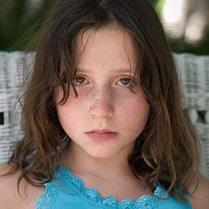
I like the style of the first one, although I found the background a little distracting. I'm assuming that what I am seeing is a result of the flash bouncing back off of the glass? The other minor point for me is her hand appears to be brighter than the rest of her. Overall, I think its a really good shot.
I like the style of the first one, although I found the background a little distracting. I'm assuming that what I am seeing is a result of the flash bouncing back off of the glass? The other minor point for me is her hand appears to be brighter than the rest of her. Overall, I think its a really good shot.
Yes, Chase. I agree with you at these points, but it seems that it feels this way at the size the pics find themselves, because it looks quite different at larger files.
Thanks for the feedback. Is that ok if I post the bigger versions? (if I can upload them bigger on my hoster, that is)
I totally agree that both look 100% better when they are larger.
The only guidelines I would suggest when determining what size to post is to keep it small enough that people don't need to scroll to see the whole picture.


")


![[No title]](/data/xfmg/thumbnail/34/34058-276eb00b31d5bfacf4028e7f729dc601.jpg?1619736257)
![[No title]](/data/xfmg/thumbnail/42/42278-22ed940cbdc5888a28d9be36006594dc.jpg?1619740086)
![[No title]](/data/xfmg/thumbnail/34/34059-47197a726f7089095bae50bfb77d8b1d.jpg?1619736258)
![[No title]](/data/xfmg/thumbnail/1/1592-cfae4a7ea791f96c6e2d03484be2e454.jpg?1619729144)