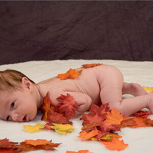
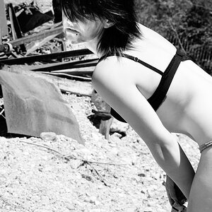
does this look ok?

wxnut

TPF Noob!
Joined
Sep 9, 2004
Messages
594
Reaction score
7
Location
Wisconsin
Website
www.dougraflikphotography.com
IMG_1852s.jpg


Or should I have the whole head showing on the B&W one with the color one over the top? Maybe any other suggestions???

Thanks,
Doug
 
I think this is adorable!!
I dont think I have any suggestions for changing it.
 
Too much highlight/reflection in the eyes for me i would tone it down or make them a little smaller, possibly put a little light on the top right of his hair so it does not get lost in the dark background or like you say have the whole head so as you can make out the profile? If you really want to go to town see if there is anywhere you can get some detail into the black trousers. very nice portrait.

tim
 
Very neat. I like it! How'd you do that?
 
I usually find that the double exposure in portraiture looks like it was stylized for the sake of stylizing the picture and doesn't add anything. I usually find it downright annoying, for some reason...maybe because it usually takes away from good shot composition, in my mind.

But this is very different. I like how the b&w/color separates the shots, and the composition takes away that superfluous look to the double shot. I like how the b&w is the background for the color shot. Each shot stands on its own quite well, but together they look great.
 
I like it but... I wouldn't have layered it the same way you have here, Instead of the B&W image being the background and the Colour image trimmed and placed over top. I would try having the Colour image the BG, Overlay the BW image over top and trim around the BG image.
 
I think it's pretty good. I do feel that the blond hair on the right side of his head (as we look at, actually his left side) gets lost (or comingled) with the hiar in the background, and there isn't a clear separation.
 
yeah, the mask is a little rough. also, its not always safe to mix color and bw. i personally don't like it. its a trend, and not a very new one. In fact, wppi albums were docked points in competition for selective coloring and mixing the two like you have in this last years judgings. your always safe having an image all bw, or all color. also when this goes to print, depending on how you print it the bw won't looks very good. however with pigment epson inks i've had great bw prints with, and good color . . . so that would work fine that way. however mpix, walmart, target, ritz etc prolly won't be able to get it right
 
ClarkKent said:
Very neat. I like it! How'd you do that?

Well it wasnt easy. I am NOT very good with photoshop, so I am sure there is an easier way of doing it. I selected all but the boy in the color picture and brought the curves to dark, making everything but the boy and stool dark. I then layered the B&W picture under it and erased the black parts of the color picture untill I was happy with what was showing as a final result.

Thanks for looking.
Doug
 
bryanwhite said:
I usually find that the double exposure in portraiture looks like it was stylized for the sake of stylizing the picture and doesn't add anything. I usually find it downright annoying, for some reason...maybe because it usually takes away from good shot composition, in my mind.

But this is very different. I like how the b&w/color separates the shots, and the composition takes away that superfluous look to the double shot. I like how the b&w is the background for the color shot. Each shot stands on its own quite well, but together they look great.

I think I get what your saying. This final result was NOT a goal I had in mind when doing the shoot. I took a kid that was not cooperating by not looking at the camera and rarely smiling, and made one of the "worthless" shots work with one of the better ones.

newrmdmike said:
yeah, the mask is a little rough. also, its not always safe to mix color and bw. i personally don't like it.

also when this goes to print, depending on how you print it the bw won't looks very good. however with pigment epson inks i've had great bw prints with, and good color . . . so that would work fine that way. however mpix, walmart, target, ritz etc prolly won't be able to get it right

For what its worth, I have redone this composistion taking a little more time to get the details right. I send my stuff to a decent lab and have not had any problems with this kind of shot. Thanks for looking and taking the time to reply.

Doug Raflik
 

Most reactions

New Topics

Back
Top