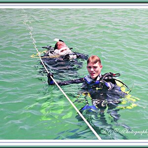
DoveDale

gizmo2071

TPF Noob!
Joined
Oct 19, 2006
Messages
861
Reaction score
0
Location
Toronto, ONT
Website
www.ummonshadow.com
Can others edit my Photos
Photos NOT OK to edit
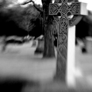
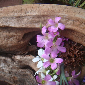
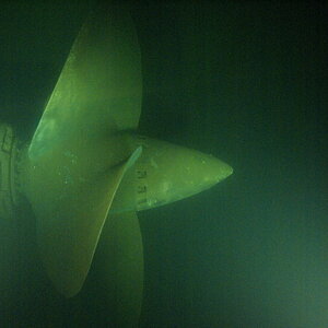
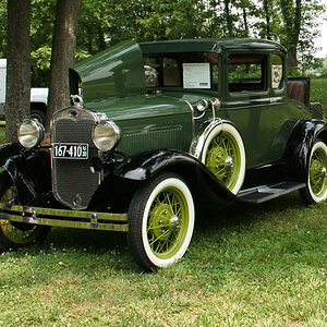
All images taken at Dovedale in Derbyshire, UK.
Let me know which are your favourites.

1
)
r%20%2842%29.jpg


2)
r%20%2843%29.jpg


3)
r%20%2846%29.jpg


4)
r%20%2845%29.jpg


5)
r%20%2848%29.jpg


C&C welcomed.
Thanks for viewing.
Matt


Very nice images overall. I think we're spoiled here though by having images embedded in the thread. It's kind of buggy to open a new window to look at each photo maybe divide them into a few threads? Makes it easier for commenting.
 
Over your last few posts, at least the ones I remember, I think I can see how you're developing a/your style. These aren't as abstract but still have that, what I think of as 'hyperventillation', look to them. Not being as abstract they're easier to comment on.

I like the textures in the first. And the green all over. Not real hot on the composition or do I really get anything out of the photo other than, 'It's kinda cool.'

The second; I've seen that flash of blue. You did pretty good catching it- I remember the blue I've seen was lighter though. Can't say for sure, it was only a flash, probably while turning my head. I think the overexposed part of the water on the left is kind of distracting though. The rest of the contrast works well.

The third one, just get rid of the sky. There's nothing really going on up there in the hills. I like what the shot tells me. Likewise with the fourth photo. Sky is overrated and usually unnecessary except for breathing. If you're going for the look I think you try to capture, lack of the atmosphere will help. Also on #4, the overexposed part of the path is too abrupt and even. Maybe more of a fade into it. I'd try maybe cloning just a bit of the darker portion into the near-white.

The last shot was my favorite. I liked the composition, but then I figured out that it is a stream instead of a path. Then it looks like the water is flowing from a larger creek instead of into it. I would have tried something a little with some of the trail I see bits of on the left. But I wasn't there and I'm not you and you were there and you are you. Maybe that's what you wanted. I'm sort of surprised that there wasn't more contrast in the shot showing that there was water there- also. The processing of the rest of the shot, the colors and details is excellent.

What I get out of your work is what I mentioned earlier- Maybe not what you're expressing, but that moment where a memory fades, or like a memory. The moment before you pass out or get dizzy from rising up too fast. Maybe the instant before ...

Apparently you found a direction to go in. Keep it up. I wish I could figure out for sure where I'd like to head; for now my style is no style.

Hope this makes sense.

Thanks alot abraxas. Thats the sort of reply I wish I could get on all my work.
It really shows how somebody else sees my work from their point of view.

I'll try to reply with what I was seeing or aiming for.

So we went to a place called Dovedale. It's like an American version of a National park I guess. Just a big protected piece of land that people go to visit for hiking and the likes.
I went with a group from my class and we were given a set time to be back at the bus for, but left free to wonder. Of course when your miles from home and given a set time to get back for you kinda have that I best not go far mentality.
So from that start I wasn't feeling the inspiration rolling. We got there just before midday and left early afternoon (about a 4 hour trip) and of course this is the worst time of day for lighting. It was a super clear day with the sun beating down, hard shadows, hot highlights and washed out colours. Wonderful.
Our aim was simple points of composition. (thirds, leading lines, compression, isolation, colours, framing, layers, etc...)

Personally, I'm not very happy with any of the images I took that day, asides from maybe the one I posted in the B&W gallery.

1) I was just testing the water to see how long i could push the exposure to try and smooth out thw water. I whacked the rock in the foreground fr a personal sense of depth to the shot and the small rapid was a good 100meteres away. (could have been taken from a higher angle and used the sides of the river to draw you into the shot)

2) Once again I was just pushing to see how long of an exposure I could get. This was tougher as I'm in a shaded area but the sun is still beating down and blowing out the tips of the water, but i think that adds to the motion in the shot. Compositionally.... there nothing to it, it's a really bad shot that I tried to save.

3) This is pretty much natural instinct to capture this shot when I saw it. I hated the colours, they were so flat and lifeless... so i tried to work with them and i agree about the sky.
This was just basic layering, leading lines, compression and the use of thirds in composition. Thats all i was aiming for. I actually really liked my reworked colours on this one, though the B&W version works quite well. (way to contrasty for peoples taste on here :p)

4) Again, leading lines, framing and thirds. I purposely dodged the end of the pathway and I'm glad your eyes went there. This was my pure intention for eyes to end up at the end of the path.
I did try a variaiton of crops on this shot and I also have it in portrait position. I actually have just seen an angle at which i like the crop better and it does cut the sky out. So maybe i'll give that a shot :)

5) This was actually the start of this little area of water. it was like a little spring that ran into the river. The movement was minimal and it was very shallow, so I knew straight away that it looked like a pathway and I went witht he idea of the path leading into the river. Should have gone for a higher angle, but I didn't have a 6ft step ladder with me at the time :p
So I worked with what I had. leading lines and thrids.

So post processing on these. Alot of people have mentioned the over sharpening. I just can't think where this has come from.
I usually sharpen with a radius of 0.3 and ammount 300% or radius of 1 and amount 100%. I only sharpened a couple from the whole series and they were only sharpened at radius 0.3 and amount 100%. So these were narely sharpened. I can only think compression has made them look that way.
I reduced the reds in them all by about 10points(from 65(thats mid-point) to 55'ish) in the shadow areas in curves. This added that very green feel to the images and thats how I saw it on the day, nothing to do with white balance, it was just the horrible colours cast by the sun I guess.
I know exactly what I was doing with the post processing. i was working like I do in the B&W dark room.
Purely contrast work with dodge and burning. It was good practice for me.

Thanks again abraxas and arhy. Appreciate it.

Crikey, well done if you just read all that, but i hope it made you understand my aims on this series alone, not how i work all the time.
 

Most reactions

New Topics

Back
Top