Dr. Blacksmith

tirediron

Watch the Birdy!
Staff member
Supporting Member
Joined
Jul 8, 2005
Messages
45,747
Reaction score
14,806
Location
Victoria, BC
Website
www.johnsphotography.ca
Can others edit my Photos
Photos OK to edit
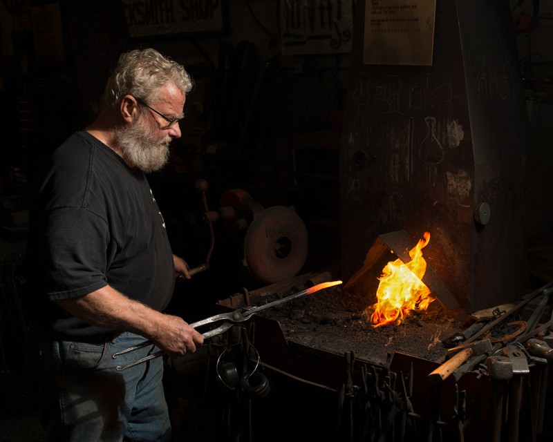
The club challenge this month was "environmental portraits". Charlie (also a Phd in invertabrate biology during the day) was at the forge at the end of our club's tractor barn, and since I just happened to have some gear with me (what a surprise, right?), I set up a speedlight in a 22" white beauty dish and grabbed a few shots. As always, thoughts, suggestions and critique appreciated.

1.
Blacksmith3.jpg

The set-up...


2.
Blacksmith2.jpg


3.
Blacksmith1.jpg


4.
Blacksmith4.jpg

Today's finished product
 
#3 is outstanding!

Nominated for POTM, August, 2017.
 
Last edited:
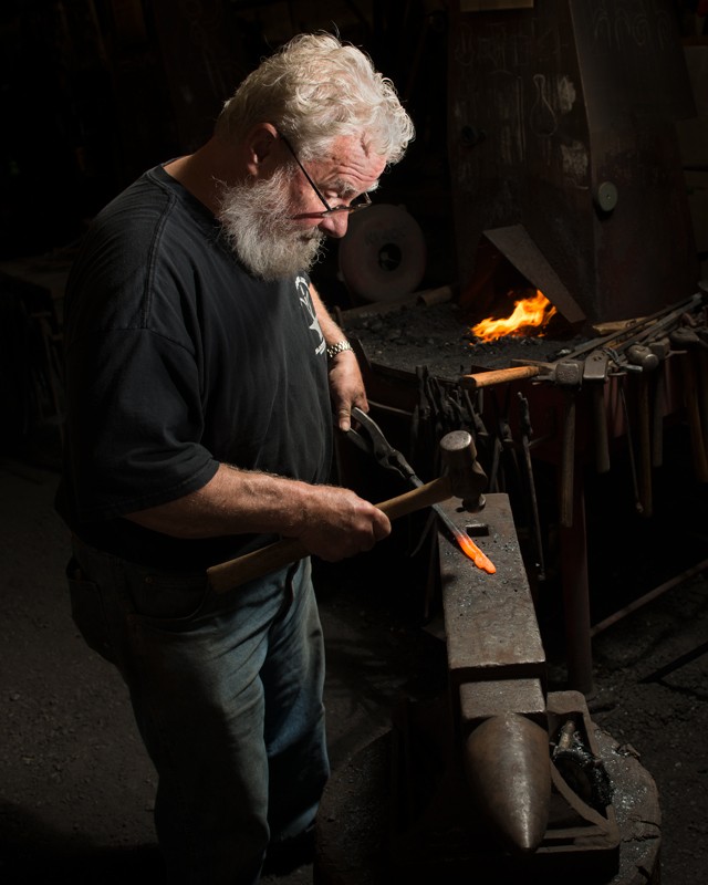
in this context its a very tough call between 2 and 3.
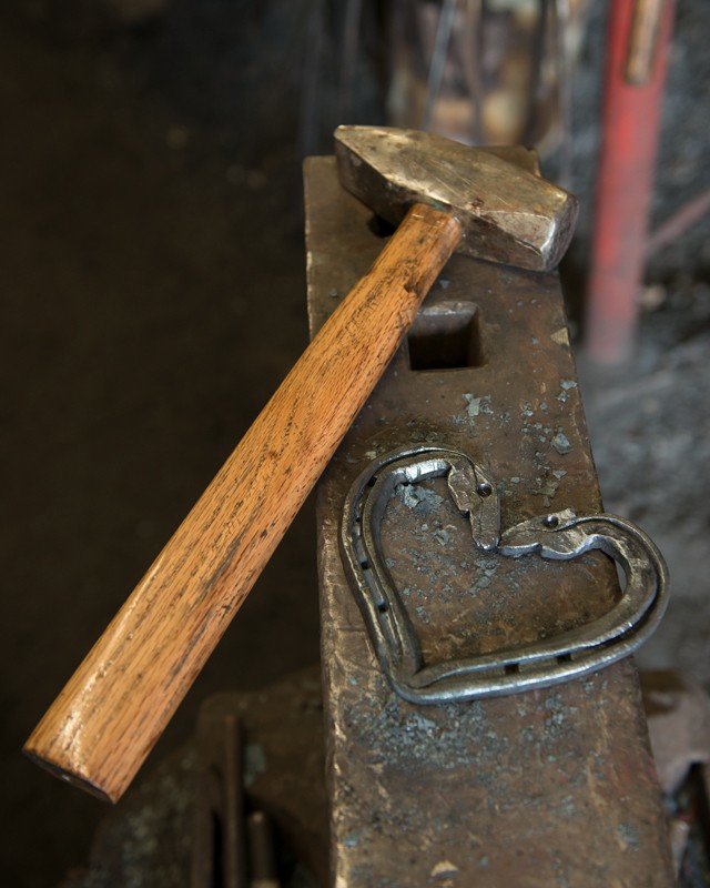
aside from my usual proclivity for "tall" portraits, i like 3 because it shows him actually working the iron, hammer in hand.
both are extremely well done shots, but those two minor nuances are what gives #3 that slight edge over #2.
#3 is great because it shows a greater area of the forge, and i think a slightly better show of the dynamic work environment.
 
I know you were asking Designer, but if I may give my thoughts as well...

In #2, there is more dark negative space and so the eye goes to the fire. The man is farther away, so you see him there, but the work is more...I dunno, passive is the word?

In #3, he's closer to be the work being done and it's more active. The light is more even and the fire is in the background, so it doesn't hog the attention. The eyes move from his face down to his hands, where you can focus on that more active phase of work. I think these combination of things makes #3 more compelling. His skills are more on display in the photo because of what he's actually doing, and the lighting and framing keeps the viewer's focus on that work, whereas the attention wanders a bit more in #2.

If I had to name the two, I'd name #2 "Heat" and #3 "Creation."
 
Adding just a bit to limr's insightful notes: The face, work, and forge form a triangle, and your subject's eyes are focused on his work, even to the point of letting his glasses slip. His arms, the anvil, and the hammer handle are adding diagonal lines. The light is strongest on his head, and falls off downward, but his body is still illuminated down to his knees. There is just enough light on the forge and anvil to put your subject in context but with some complete darkness to help frame your subject. All that with only one light! The only thing that this shot is lacking is a shower of sparks flying out from his hammer blow.
 
in this context its a very tough call between 2 and 3.
aside from my usual proclivity for "tall" portraits, i like 3 because it shows him actually working the iron, hammer in hand.
both are extremely well done shots, but those two minor nuances are what gives #3 that slight edge over #2.
#3 is great because it shows a greater area of the forge, and i think a slightly better show of the dynamic work environment.
Thanks!

I know you were asking Designer, but if I may give my thoughts as well...

In #2, there is more dark negative space and so the eye goes to the fire. The man is farther away, so you see him there, but the work is more...I dunno, passive is the word?

In #3, he's closer to be the work being done and it's more active. The light is more even and the fire is in the background, so it doesn't hog the attention. The eyes move from his face down to his hands, where you can focus on that more active phase of work. I think these combination of things makes #3 more compelling. His skills are more on display in the photo because of what he's actually doing, and the lighting and framing keeps the viewer's focus on that work, whereas the attention wanders a bit more in #2.

If I had to name the two, I'd name #2 "Heat" and #3 "Creation."
Awesome, thanks Lenny!! :D

Adding just a bit to limr's insightful notes: The face, work, and forge form a triangle, and your subject's eyes are focused on his work, even to the point of letting his glasses slip. His arms, the anvil, and the hammer handle are adding diagonal lines. The light is strongest on his head, and falls off downward, but his body is still illuminated down to his knees. There is just enough light on the forge and anvil to put your subject in context but with some complete darkness to help frame your subject. All that with only one light! The only thing that this shot is lacking is a shower of sparks flying out from his hammer blow.
Got it! :)
 
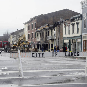
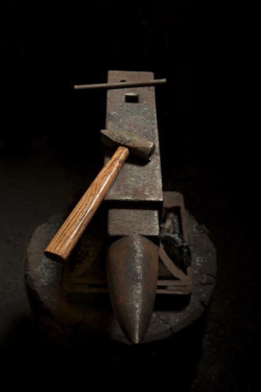
Like them all!!! #3 well deserving of nomination, but I'm surprised no one's commented on #4. To me it is an excellent shot. Simplistic yet, tells the story of raw metal being hand forged to finish product. The we'll worn handle and remains of slag on the anvil adds to the story.
 
#3 is excellent. Retrospectively, the only thing I'd like to see different is just a slight hint of a rim light on his back to separate him from the darkness a little more. But that's being super nitpicky.

Great light for a single light beauty dish setup.. that's not what I would have thought was used here. At all.

Nice work man.
 
I think it is a very nice series of images. While not a bad image at all, personally I think the story is told with the last 3 images. You have the steel coming out of the forge, then being worked and then the result.

I'm jealous that you got this with a speedlight.
 
Like them all!!! #3 well deserving of nomination, but I'm surprised no one's commented on #4. To me it is an excellent shot. Simplistic yet, tells the story of raw metal being hand forged to finish product. The we'll worn handle and remains of slag on the anvil adds to the story.
Thanks! Actually that was taken after everything was put away and he grabbed me to show me his "Romantic Ponies". I laid it on the anvil, opened the door and cranked the ISO.

Excellent set and well deserved nomination!
Thanks Alex! :)

#3 is excellent. Retrospectively, the only thing I'd like to see different is just a slight hint of a rim light on his back to separate him from the darkness a little more. But that's being super nitpicky.

Great light for a single light beauty dish setup.. that's not what I would have thought was used here. At all.

Nice work man.
Thanks and yeah, lighting is quite optimal, but there are four forges there and all were in use, so my intent was to mask the other people out as much as possible by using the lighting.

#3 is Excellent!
Thanks Logan!

I think it is a very nice series of images. While not a bad image at all, personally I think the story is told with the last 3 images. You have the steel coming out of the forge, then being worked and then the result.

I'm jealous that you got this with a speedlight.
Thanks Ron... I loves me my beauty dish!!! :D
 
I'm at lunch on my phone using talk to text. I prefer number three out of all of these mainly just because it has the guy that iron, the Anvil, snd the hammer
 

Most reactions

New Topics

Back
Top