
AprilRamone
TPF Noob!
- Joined
- Nov 3, 2005
- Messages
- 1,280
- Reaction score
- 2
- Location
- Denver
- Website
- www.apriloharephotography.com
- Can others edit my Photos
- Photos OK to edit
So, I bought a fancy new website back in June and STILL haven't gotten it up as I've been so busy and just haven't had the time to make it how I want it. But, I'm getting there")
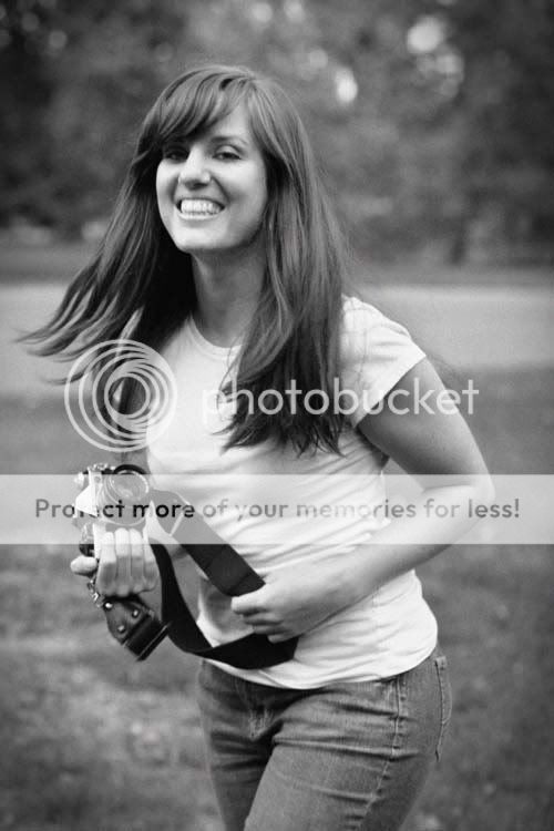
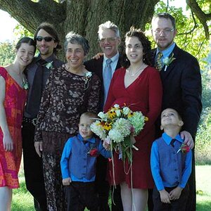
Anyway, I wanted to put up a new picture for my about me page so I had my sister (who I am trying to train as my assistant) come with me and do the shots so I could critique her and help her with the basics. So, I hope I don't get in trouble for posting these since she technically took the shots...but I did all of the PP)
I am probably going to use this one since I am smiling in it and look more friendly and nice

But I'm wondering what you guys think of maybe using this one? I like that I'm laughing and there's motion in it, but it's kind of blurry so I'm afraid clients will think we don't know how to take a good shot!
And, I only post this one because it's my favorite. But, I probably won't use it on my About Me page since I look kind of serious and I want my clients to think I'm fun and happy (Because I usually am!) It also has a weird composition...my sis is still learning
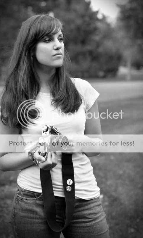
I'm pretty much decided on the first, but I like second opinions....
Anyway, I wanted to put up a new picture for my about me page so I had my sister (who I am trying to train as my assistant) come with me and do the shots so I could critique her and help her with the basics. So, I hope I don't get in trouble for posting these since she technically took the shots...but I did all of the PP)
I am probably going to use this one since I am smiling in it and look more friendly and nice
But I'm wondering what you guys think of maybe using this one? I like that I'm laughing and there's motion in it, but it's kind of blurry so I'm afraid clients will think we don't know how to take a good shot!
And, I only post this one because it's my favorite. But, I probably won't use it on my About Me page since I look kind of serious and I want my clients to think I'm fun and happy (Because I usually am!
) It also has a weird composition...my sis is still learning
I'm pretty much decided on the first, but I like second opinions....


![[No title]](/data/xfmg/thumbnail/33/33489-cc76e5d22658c0f79ccb4ae9d307610d.jpg?1619736003)


![[No title]](/data/xfmg/thumbnail/42/42230-fa8ace50a80342c7d91db1431f911bab.jpg?1619740048)