Hi. I like the color and contrast, myself. Perhaps the very low tones could be brought up selectively to bring out the two main subjects (especially the skin tone on the guy on the left).
The general tone and color caught my eye, and I think it makes the picture more focus on the subjects.
By the way, what is that washed-out color-casted technique called again? I know there is a name for it, but I forget.
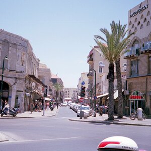
I don't care for the fact that the guard is looking at you. It pulls me too much into what's happening and takes away from the guard who is kinda "lazily" leaning there.
I also don't love the crop and squareness of it. I think it would have been really neat for it to be more longish and to the left, so you could get more of the pattern of people repeating in the background... makes for a neat backdrop of bodies, which is a weird effect.
I also think there could be a lot less of the building behind the security guard on the right (again, pan left a bit)
I think you might brighten it a bit and deal with the colors a little differently, but I also think its a nice effect you have accomplished with your existing choices, so I wouldn't necessarily change much there.
So, basically, I think you totally saw a really cool shot, but I think you just sorta missed it by a HAIR.
A less busy background with accurate exposure, less contrast, properly balanced colour away from the green hue, postprocessing and the use of fill flash might improve this shot.


![[No title]](/data/xfmg/thumbnail/42/42065-b846d670a79653fe9a60fc2ba4bc683f.jpg?1619739998)

![[No title]](/data/xfmg/thumbnail/31/31018-a537939c7ad9fc1126461101c651a8a0.jpg?1619734572)
![[No title]](/data/xfmg/thumbnail/42/42034-6262420ff3ea238f05395bbcc7ae1f28.jpg?1619739985)