Engagement Photos - C&C please

Derek Zoolander

TPF Noob!
Joined
Dec 15, 2008
Messages
300
Reaction score
0
Can others edit my Photos
Photos OK to edit
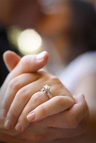
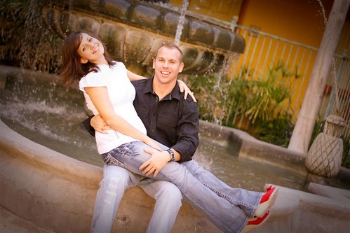
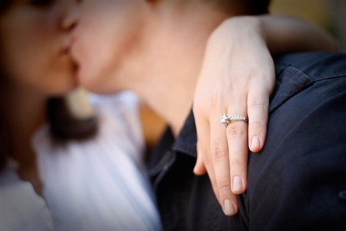
My friend asked me to take engagement photos for them and I'm thinking about maybe doing some side work in photography so I thought this would be a good opportunity to make a first attempt at engagement photos and maybe have something to start a portfolio. Please tell me what you guys think and what can be fixed so that I can learn from this experience. Thank you.

1
3873738532_685dfdbaa2.jpg


2
3873738350_4863ea837c.jpg


3
3872944267_a2177a4e1e.jpg


4
3873730126_3b4209f48a.jpg


5
3872945091_2392b062e4.jpg


6
3873733690_f962907983.jpg


7
3873731904_f257cd3052.jpg


8
3873737794_5ded835732.jpg


9
3873734456_3fb063492d.jpg


10
3873733246_f4f6095e29.jpg


11
3872947681_3cb5f73eab.jpg


12
3873735952_4672f950e9.jpg


Too many photos? Sorry...

Here is the rest of the set with my favorites: Steve + Ashlee Select - a set on Flickr

Here are ALL of the photos: Steve + Ashlee - a set on Flickr

Thanks again everyone!
 
Very nice for a first engagement shoot. There are some fun moments in there.

#4 is cute. Its more of a "best friend" pose, but it can work depending on the couple

I'm liking #5. Even if they are a bit underexposed, I think it adds to the feeling of intimacy in the image.

#6 is nice, i like the desaturation + leaving the red

I dont like #8. I can see what you were going for, but the main irritant is the fact that the flower thing on the ground is not centered in the image and makes it feel lopsided.

Not a fan of #10. It feels too fake and posed. Her shoe is somewhat cut at the bottom and not well balanced with the space she has overhead. The white in her shirt also looks blown
 
On frame 1,3,4,and 5, I think you are creating unneeded, unwanted tension by allowing the subjects to come too close to the edges of the frame. On shot 1 you cut off his hand. That's called an amputation. The camera needs to show them slightly lower down,with his hand in his pocket or on his hip.

Also, you're creating some poses and compositions where the camera is being held horizontally for no apparently good reason, causing the people to be confined to less than 20 percent of the total frame area, such as in frame 9; the environment there is not that interesting,and their clothes appear to be burned out, with a post-processing correction trying to cover that up.

If it makes sense to show the location, then a horizontal composition makes sense, but with two people, a horizontal composition usually means that the peple will be very diminished and the environment will dominate as in 1,4,and 5.

In 5,with them nuzzling at the outdoor cafe...why devote the entire right hand side of the frame to a bunch of disorganized chairs? The subliminal message is "chaos" and "confusion",and your paying clients are minimized at the expense of all the tables and chairs. I thunk you are 'close' on a lot of these compositions, but are allowing the people to be positioned too closely to the edges of the frame. You've got a nice variety of lighting conditions, but I do think that you need to very carefully evaluate using horizontal compositions where feet or hands are positioned at or near the edges of the frame, causing visual tension. I think some clients would like to have some vertical compositions where they,themselves, are the stars of the image and not so much the locations.
 
Two very different responses! This is great, thanks guys!

Very nice for a first engagement shoot. There are some fun moments in there.

#4 is cute. Its more of a "best friend" pose, but it can work depending on the couple

I'm liking #5. Even if they are a bit underexposed, I think it adds to the feeling of intimacy in the image.

#6 is nice, i like the desaturation + leaving the red

I dont like #8. I can see what you were going for, but the main irritant is the fact that the flower thing on the ground is not centered in the image and makes it feel lopsided.

Not a fan of #10. It feels too fake and posed. Her shoe is somewhat cut at the bottom and not well balanced with the space she has overhead. The white in her shirt also looks blown

I agree #5 is underexposed, I wish I could go back and do it again. Agreed with everything else you say too. #10 is awkward since it's not very natural. I'm finding that posing people is a really difficult part of this process...I'm thinking that just takes practice.


On frame 1,3,4,and 5, I think you are creating unneeded, unwanted tension by allowing the subjects to come too close to the edges of the frame. On shot 1 you cut off his hand. That's called an amputation. The camera needs to show them slightly lower down,with his hand in his pocket or on his hip.

Also, you're creating some poses and compositions where the camera is being held horizontally for no apparently good reason, causing the people to be confined to less than 20 percent of the total frame area, such as in frame 9; the environment there is not that interesting,and their clothes appear to be burned out, with a post-processing correction trying to cover that up.

If it makes sense to show the location, then a horizontal composition makes sense, but with two people, a horizontal composition usually means that the peple will be very diminished and the environment will dominate as in 1,4,and 5.

In 5,with them nuzzling at the outdoor cafe...why devote the entire right hand side of the frame to a bunch of disorganized chairs? The subliminal message is "chaos" and "confusion",and your paying clients are minimized at the expense of all the tables and chairs. I thunk you are 'close' on a lot of these compositions, but are allowing the people to be positioned too closely to the edges of the frame. You've got a nice variety of lighting conditions, but I do think that you need to very carefully evaluate using horizontal compositions where feet or hands are positioned at or near the edges of the frame, causing visual tension. I think some clients would like to have some vertical compositions where they,themselves, are the stars of the image and not so much the locations.

Thanks for your comments Derrel. Great advice at the last bit there. Seems I got carried away trying to capture the nice surroundings instead of making them the "star" as you say. After looking through many of these, I did lean more to the horizontal pictures. If I take your advice correctly, you're saying I need more portrait oriented photos, right? I'm not questioning you when I ask this, but am sincerely asking, is it more typical for engagement photos to be portrait rather than landscape? This would be good to know. I guess there are appropriate orientations depending on the picture. Would I be correct in saying that you would think these pictures would be on point on many of them if all I did was make them portrait instead?
 
Overall, not a bad set at all for a first try. Your exposure and composition is quite nice for most of them. But (there is always a but, isn't there?):

#1 - Tile wall and concrete floor give a fairly cold feel to the image. Not the best for a happy moment.

#2 - Blue is also a cold color but it works here. The colors in their clothes and the floor work beautifully here, imho. The only thing that bothers me is the black circle right under her ear. What is that?

#3 - and 4 The romantic shots that don't quite work because of composition and details. In #3 the horizon is off and the buildings (?) seen on the right are annoying. In #4, nicely exposed but very busy and it takes away from them. I can just imagine them sitting on the same tiles but leaning against the side wall.

#5 - ?

#6 - Doesn't do much for me but quite nice as far as selective coloring goes.

#7 - I want to see the background just a bit more in focus so we know for sure what we are looking at. But for artsier people it will work. It works for me but I worry it won't with most people.

#8, 9 and 10 - blah

#11 - That's what I was talking about when commenting on #7. Very nice.

#12 - Very nice also even though it has problems. Exposure is wrong. Horizon is wrong. But I don't mind either. You get a very warm, fuzzy feeling about those two being together.... and that is great.

Again, overall very nice set. Not standard BS, not boring posed photos. I would think the couple would be happy.
 
for 11th photo, u have excelled in beauty of shooting an engagement photo. great.
 
#7 and #11 IMO are good shots, very artistic and technically more sound than the rest. But as Cloudwalker said just a bit sharper on the BG on #7 would be better.
Most of your shots really have some lighting issues. But as stated for your first attempt good job.
 
I actually like the chaos formed by the chairs in #5 and feels it adds more to the mood of the image. Admidst the chaos, all they care about is each other. Even when the restaurant closes,they are still there for each other.

I agree on making them the star of the photos, but I dig #5 :)
 
Overall, not a bad set at all for a first try. Your exposure and composition is quite nice for most of them. But (there is always a but, isn't there?):

#2 - Blue is also a cold color but it works here. The colors in their clothes and the floor work beautifully here, imho. The only thing that bothers me is the black circle right under her ear. What is that?

#6 - Doesn't do much for me but quite nice as far as selective coloring goes.

#7 - I want to see the background just a bit more in focus so we know for sure what we are looking at. But for artsier people it will work. It works for me but I worry it won't with most people.

Again, overall very nice set. Not standard BS, not boring posed photos. I would think the couple would be happy.

Thank you very much cloudwalker for your comments! #2: The black thing is her earring and i didn't notice it before, but now that you point it out it definitely looks funny. Maybe I can PS that out... Good catch! #6: I was trying to go artsy here by chopping off their heads and with the selective coloring. They're actually probably going to use that photo for their invitation. So I guess it's a preference thing. #7: What is the horizon in this photo? The table ledge? where should it be positioned? Thanks for your time.

for 11th photo, u have excelled in beauty of shooting an engagement photo. great.

I really appreciate you saying that and thank you for taking the time to compliment.

#7 and #11 IMO are good shots, very artistic and technically more sound than the rest. But as Cloudwalker said just a bit sharper on the BG on #7 would be better.
Most of your shots really have some lighting issues. But as stated for your first attempt good job.

Thank you DRoberts. I have some work to do on lighting. I actually need to figure out what metering is and how to do it. Right now I just keep messing with settings until I get it right. I'm assuming metering will help speed up the process.

What type of lighting set-up did you use for the shots overlooking the town?

MikeBookPro, I just used a 430ex II and a shoot through 43" umbrella. I think it was on 1/32 power. If i could do it again, I would do it a big brighter. Although some people are saying the subtle lighting works...

I actually like the chaos formed by the chairs in #5 and feels it adds more to the mood of the image. Admidst the chaos, all they care about is each other. Even when the restaurant closes,they are still there for each other.

I agree on making them the star of the photos, but I dig #5 :)

This is EXACTLY the look and feeling I was going for. Except, if I could reshoot it, I wouldn't have them so close to the edge. But they absolute LOVE this photo. Just not as perfect as I had hoped. Next go around I'm confident I'll get better.

Again, thanks everyone for taking the time to look for me.
 
Yeah, I'm a stickler for details. Maybe it comes from my time as a photojournalist when it was hard to control the details :lol:

But I left out one "big" problem I had noticed to see if anyone would react. And no one did :lmao: Which probably means that most non-photogs will not know what it is. I'm talking about the umbrella in the mirror in #12. I imagine you're in there too...

But, again, good set for a first try. Cheers.
 
I didn't read everyone's replay, so forgive me if I repeat what others have already stated...


1. Not really digging it. The wall (which I think is pretty cool on its own) is a major distraction, and it lacks color contrast that would separate the couple and keep me focused on them.

Also, be mindful of clipping fingers, hands, and feet at frame edges.

2. Holy Busy, Batman. This is a visual assault. I'm not focused on the couple at all. Again with the cutting of the feet.

3. Love the shot and the lighting. It has a very contemporary feel. A tad under exposed...easily corrected with a levels adjustment. Not sure if it says "look at this couple" though. Beautiful, anyway.

4. Great space for photography, but I would have gone for a tighter shot of the couple, and the bullseye composition isn't tripping my trigger, either.

5. Brilliant. I love it. I love everything about it.

6. Selective color is tricky to do. The client may love it, but as a photographer, unless the coloring is poignant, I usually end up thinking about the process.

7. fairly cliche, but you know what? It sells. The edge tension with the male hand is rather troublesome.

8. Again, great space, but I think the tighter shot would have been more beneficial.

9. I like 9...I think it is a good use of the space. The vignette is a bit forceful, but it does keep me focused on the couple.

10. Expected. It really doesn't do anything for me.

11. Again, it is cliche, but it is undeniably pretty and precious. I'm sure the client (especially the gent who paid for the ring) loved it.

12. Love it. Great moment, great color palette, I even like the horizon line gone akimbo.

Awesome critique. Thanks for taking your time to do that for me and let alone on every image. Definitely informative for me! One question, what do you mean in #12 when you say the horizon line gone akimbo? is the bar table the horizon line in this photo? Also, what's akimbo? thanks again!
 
6 and 12 are the best for me. in the #1,3,4,8,10 there's nothing special, quite anonymous shots
 
Awesome critique. Thanks for taking your time to do that for me and let alone on every image. Definitely informative for me! One question, what do you mean in #12 when you say the horizon line gone akimbo? is the bar table the horizon line in this photo? Also, what's akimbo? thanks again!
Akimbo = cockeyed, off kilter, not straight.

Yes, the bar table acts as a horizon line in this shot. It isn't a real horizon, but it is a table, something that one knows is a level surface, and it isn't level in the shot, and it calls attention to itself. Usually this is bothersome for me, but from time to time, an off kilter horizon will add a certain je ne sais quoi.
 

Most reactions

Back
Top