Eno Bull Photography II

Eno Bull

TPF Noob!
Joined
Jul 4, 2016
Messages
4
Reaction score
0
Location
Bronx, NY
Website
www.enobullphotography.com
Can others edit my Photos
Photos NOT OK to edit
Good Day Everyone,

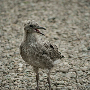
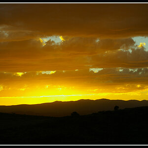
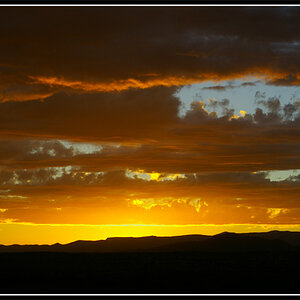
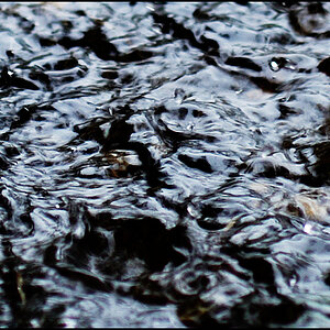
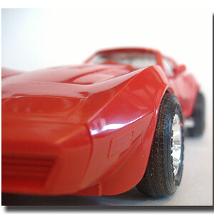
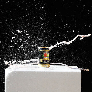
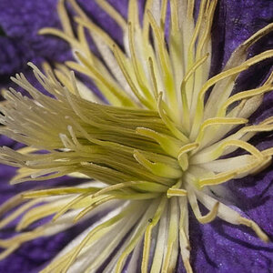
It's been a few months since I've had a chance to share anything here on this forum, but I'm back with a handful of images I'm particularly proud of and wanted to share them with you!

Hope you enjoy. (All constructive criticism is welcomed)

Chakira Yellow.jpg

Bianka.jpg

Ree.Nuh.jpg

Bad Twins.jpg

Twins.jpg
 
I think all of these are fine images I particularly like the middle three. These are just my personal nitpicks.

First image:
This one is probably my least favorite. I feel like the light and colors are a bit to harsh. Maybe some softer light might have been more flattering. The color thing might just be my personal taste or my monitor. I'm also not a huge fan of landscape style portraits like this in general but the composition in this one in particularly doesn't do much for me. Perhaps framing the model to the left or right might have more for a more interesting composition. The models expression seems like she might be slightly squinting or something facing into the sun?

Second:
I really like this one! I also really like how the model is faced towards the clock or whatever this is on the wall. The only nitpick I have with this one is the shadow being cast behind the models left arm. I would have removed that in post.

Third:
Again I really dig this one but I think a rim light or hair light off to the models right side would have really set this on off by adding a bit of separation from the background.

Fourth:
I really light this one as well particularly the composition, although I do feel like it was cropped in a bit much or framed to tighly and feels a little claustrophobic to me. I would have liked to see the entire left arm of the model in the back and the little bit of hair cut off on the model in the front. The image seems a bit under exposed to me and I the eyes are too dark. I probably would have tried to brightened the eye sockets a bit for the front model. Otherwise I think this one is a really cool concept and interesting to look at.

Last image:
I really like the composition and the way the models are posed. The only thing that kind of ruins this one for me is the blown out highlights in the the dress. For me those blown highlights draw my eye to that and away from the models faces.

These are just my oppinions take them for what they are worth to you. I'm not a pro or anything. Overall I think they are really good and in some cases could be great with some different or added post processing.
 
Image four, of the two blonde models in dark clothing: very evocative!
 
I see a lot of potential in these and future images, but ... as these are posed photos I would like to see more control on the camera end. Some quicks remarks: #1- I find the very strong horizon line running through the head at eye level distracting. I like the symmetry of the jetty ocean and subject, but, maybe a square format would add additional impact to the symmetry. #2- Good exposure good pose, but too much dead space between clock and subject. #3- No definition between hair, clothing and background is distracting. Again, a square format with symmetry, the off-center placement adds nothing to the image. #4- This is quite interesting, but the exposure seems off. Perhaps a fill flash for the eyes and a bit more light for the 'twin' in the background. I don't like the total dismembering of the background arm by the foreground head. Moving the background twin a bit to the right and lower would tighten the image and reattach the arm. #5- I like the building as a background, but the converging lines are distracting. Also the Range Rover is very distracting, a different angle would have easily eliminated the distracting front of the vehicle. The bit of hair in the face and the downward/closed eyes are both negative. The white dress gets blown out. The B&W conversion lacks punch and is a bit muddy. The choice of a cobblestone road was an excellent decision. The composition of the dresses flowing out of the frame is very nice.

All your blacks lack detail ... sometimes that is good and sometimes it isn't so good ... but as a general 'style' it isn't good. Good photography is comprised of attention to details. In spite of all my negative remarks, I see a lot of potential and I definitely want to see more of your shoots.
 
I totally agree with Gary would love to see some more from you!
 
Welcome to the forum.

Just a reminder for future reference that photos posted for comments and critique should go in a separate thread in one of the Photo Gallery forums.
 

Most reactions

Back
Top