Everyone look!!!

Tyson

TPF Noob!
Joined
Nov 19, 2006
Messages
652
Reaction score
1
Location
Newark Ohio
Website
www.tls-photo.com
Can others edit my Photos
Photos NOT OK to edit
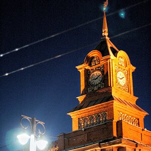
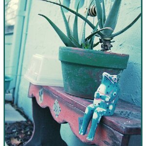
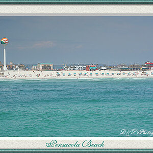
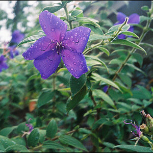
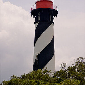
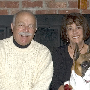
Ok now that I have you here, what do you thick of these shots?

Hardcore C&C let me wha tI did wrong or right.

post2Medium.jpg


post4Medium.jpg


post3Medium.jpg


PostMedium.jpg
 
The lighting is very flat and the colors appear a bit washed out. also in number 1 the vertical llines are not straight to me it just doesn't look right.
 
To me, the background isn't interesting enough to include so much of it. I'd zoom in more or crop out more.

Maybe use telephoto at a wide-open aperture to throw the background out of focus?

Keep experimenting.
 
#1....fairly good comp, but she could use a bit more 'head room' above her. I agree that the vertical lines are throwing off, but a crop with a tilt would fix that.

#2 crop tighter to her, as the background is boring....or show her off to the side and a whole lot more background

#3 she centered....remember rule of thirds and put your coi on one of those intersections

#4 you have the right idea for the comp...but too much bright sky with NO interest..... remember "sky white, shoot tight"

I dotn know how much of a newbie you are, I assume fairly new to photoography.....but overall good job and keep shooting!
 
i think that the focus is a bit off on picture two, and i agree with emogirl about the background
 
Well, I think you chose a fine location for your portraits here, but you still haven't composed your pictures to their optimum.

What I think about the first I already expressed in Photo Critique where it also shows (alone), and I am glad to see you tried some of what I said in the second, though you might consider cropping in more from all sides to bring her out more. There's lines that give you some good help for the endeavour!

Photo 3 has the same issues as does #1, again there is that blue thing in the background that invariably attracts my eye and piques my interest to find out what it is ... and if that isn't distracting from your daughter's (?) photo then I don't know what else is... and you can't want that, can you? But there is so much room for cropping, you can still go creative with the image as it is. No problem.

Actually, I quite like the concept of the last almost best of all, if only that sky hadn't been so utterly bland - overcast, and still bright...
Again some cropping could bring out more, place her even further left, i.e. lose some on the left, crop in from above to retain your usual print ratio, and combine portrait with background (would be my idea).

All in all they are a bit flat colour and contrastwise and could do with some play in the levels or the curves (I should ask Mark about the difference between the two, as I don't see any difference in the results, but I fear even now that I might not understand his answer :oops: ).
 
just to add a bit:

1. white balance off in number one

2. maybe not the best day for that sort of photography. bright light is not good either as it casts too harsh shadows, but this now seems to have been a particulary dull day.

3. gave the thread the wrong heading
 

Most reactions

New Topics

Back
Top