Exit to Eden on the Beach

meg27

TPF Noob!
Joined
Aug 22, 2005
Messages
116
Reaction score
5
Location
Chichester
Website
www.mojocreative.co.uk
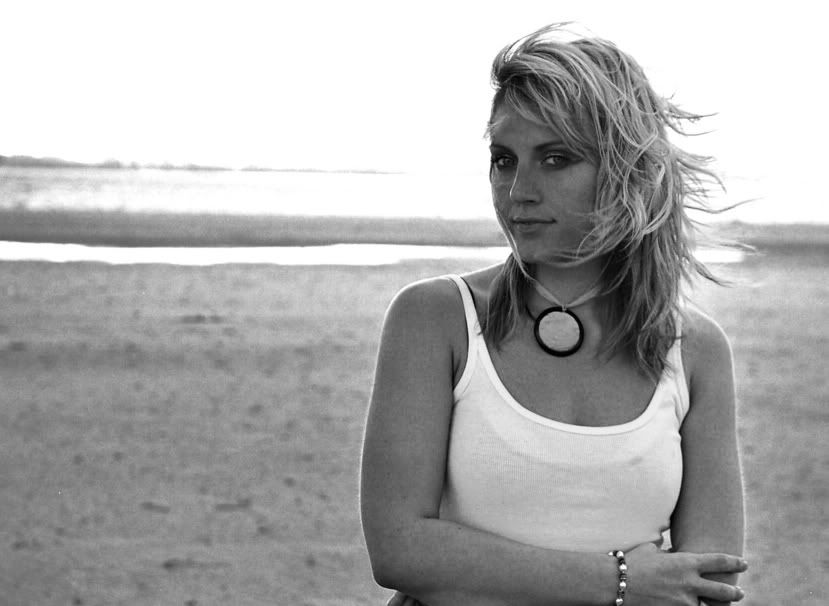
Hi, In my last post Raymond J Barlow said that he thought this picture was really good, so i thought i'd post it up and see if anyone else likes it!
Its from the summer, and a shoot i did for a band called Exit to Eden on my Pentax mz 5n 35mm. They wanted some portraits to send out with thier CD.

13edit_bw3.jpg


Let me know what you think. xx
 
Nicely composed shot and I like the way her hair is blowing.
I'd crop it in some from the right and a lill from the top. Also she is too dark...you need to dodge over her to brighten her up.
 
nicely composed.. like the way her hair is flowing but i find her face a tad bit dark.. prob go with jonK's suggestion :thumbsup: also correct the horizon if it isnt intentional

thanks for sharing :D
 
Very nice. I agree with Jon and Mansi. Those little touch ups will make it even better. Great shot.
 
I'd also crop & lighten it. Maybe also straighten a bit. Other than that, it's a cool picture!
 
Ok...thanks for your comments!
So i took the photo back into PS (it was colour originally) and realised that it really is quite a strange picture. The girls had dressed up in these bright colour clothes with this really quite disqusting eye make-up. I think this is why i must have originally gone BW. Any way i had a little play with it, but i'm not much happier with the picture. I unfortunatly only have the image from the CD that the developers did, and having looked closer, the quality is apalling! (the girls kept all the negs and originals, should get them back!)
So i think i will give up on them, they're just not quite right!

13edit_bw3a.jpg


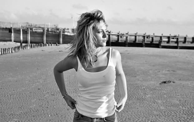
This is another one that i think is quite nice...(see what i mean about the colours and the makeup!)
But which way would you crop it? Nice detail to the left of her, but she looks to the right...
29edit.jpg


29editbw.jpg
 
I like your crop and the lightening you've done :D I don't mind thegrainy feel to it...add s something for me.
The only thing that really appeals to me in the second is the nice light...the pose isn't very flattering tho it has a quite natural feel about it. Also the centre positionng in the frame doesn't work on this shot....I'd crop most of the left side and that , IMO, would improve it a lot. Prefer the BW version.
Thanks for sharing these:D
 
thankyou! I've had another look at the edited one and i think your right, it is much nicer. Some times you can get so involved somthing your editing that you become too aware of the changes you have made! Its good to look at in a fresh light!
Thanks for your comments!
:)
 
i like the newer version of the one you posted originally too! lightening her face gives it an altogether better look.. just fix that tilt a bit as i mentioned earlier.. and i think you got a keeper :D
i prefer the b/w of the second shot... i would refrain from positioning her int eh center of the frame.. i'd say crop out some of the left.. maybe have it portrait style :D
hope this helps :)
 

Most reactions

New Topics

Back
Top