Fake vintage studio stuff - NSFW

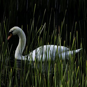
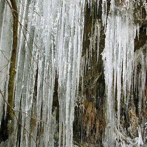
One more from the same occasion. I honestly believe it to be the best. To good to spoil with trashy PP ;)

3240883513_9403521a6a.jpg
 
Last edited:
I would love some critique on the last one aswell. And give me CRITIQUE, damnit! ;) I want to improve.
 
OK on the last one, It needs to lose the gold tint to the mask. she needs to be offset to the right and more black space above to reduce her prominence in the image. It will give her the angst that you seem to have been striving for. the exposure is wonderful and the pose, with the offsets I suggested is great. She is vulnerable and is with drawn into herself because of it. If you want to keep the tint, warm up the body slightly with a slightly stronger gold tone, or make it colder with a very light cool Blue tone to her skin. A touch of color on her lips might be good, or not. These are of course simply suggestions. It is a great shot, but could be better. BTW I do not think the wings are cheesy.

Judge Sharpe
 
Ok, I did not see it brought up so I am going to. I am assuming these where done digitally given you mentioned "the digital "perfect" look", Also I am assuming you are looking for C&C on the vintage effect you where looking to achieve.

Well, my self being a big lover of vintage nudes and erotic imagery, I think you have a long ways to go. Yeah they look aged, but old wine does not necessarily mean a good vintage does it. They look like they where poorly maintained. The base images are fine but it is in the PP that it fell apart. Something like this is an artistic effort, and like any artistic endeavour the key is good reference material. Reference material will make or break the entire effort. Mark Rotenberg has prolly one of the most comprehencive collections of vintage nudes and erotic imagery. On his website he has a Photo use inquiries page. With imagery from the 1870's to the 1970's, his archives could proove an invaluable resource If you truly wish to look into emulating vintage nudes and the like.


Personal notes on the images them selves:

I know you said you don't want to over do it but, whatever methoed you used to create the watermark (most noticable in #2)...It's the same in every one of them. In IRL, those watermarks unless it was on the lens (it's too sharp to have been on the lens but) would very from image to image, thus they should very when digitally recreated. Don't be afraid to use the photoshop grain filter, it ain't perfect but it would suffice.

Also, I personally perfer a faded sepia for things like this, but that is a personal preferance.


*EDIT*

Damn, old thread. Need to pay attention when checking online users :(
 

Most reactions

New Topics

Back
Top