3of11
TPF Noob!
- Joined
- Mar 31, 2008
- Messages
- 292
- Reaction score
- 0
- Can others edit my Photos
- Photos OK to edit
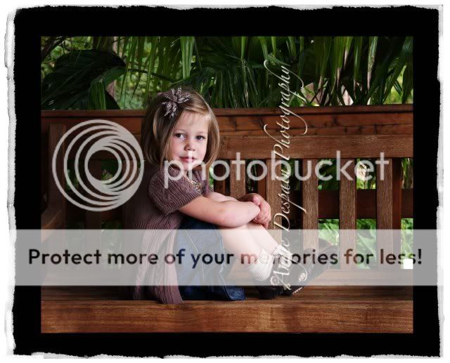
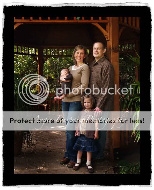
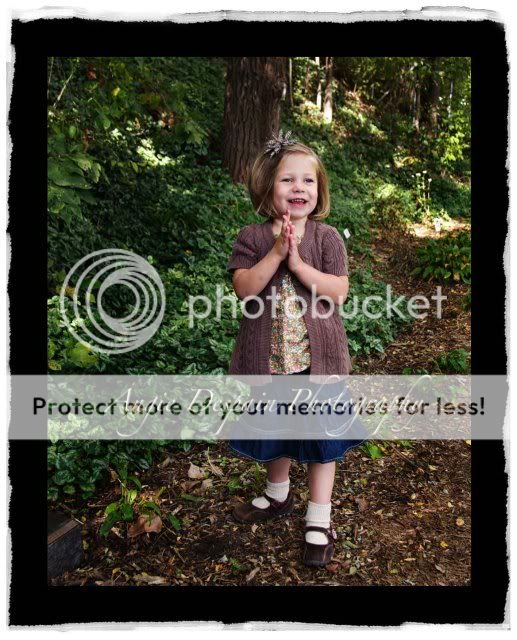
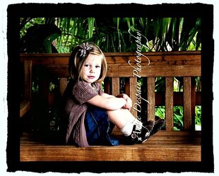
I thought this photo shoot went pretty well. I like how the pictures turned out, which means I don't know where to improve. I'm not saying that I think these are incredible, I just need more eyes to see what I can't see. Let me know what you think. I always learn so much from feedback. Thanks in advance.
1.
2.
3.
4.

1.
2.
3.
4.


![[No title]](/data/xfmg/thumbnail/37/37533-7e5a25ced65c369c377ecf341b05e1d0.jpg?1619738132)