Fear

Tony275

TPF Noob!
Joined
Aug 21, 2005
Messages
12
Reaction score
1
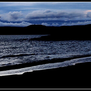
I was playing around with some long exposure shot's when I noticed the effect of walking in on one of them, It seemed to give a ghostly effect and thinking about it for a while I tried some shot's, Here's one of them.


Fear.jpg


I know the background wrong but It's just the foreground I would like critique on please. Does this work or not, I can't decide on it.

Many Thank's Tony
 
maybe if you made it bw. the photo is way too filled with colour and i'd rather call it arranged noise than subjects and noise apparent. the idea is nice but too complex, it bothers the eye. that's why i think it would maybe be better in bw, it would really ease off the eye... :D
 
b/w might work if I try it with a few different setting's,thank's for The idea any other sugestions welcomed.
 
this is from the same set,but I've taken your advice and destaturated and changed a few thing's, I think for the better, what do you think.


fear2.jpg


Tony
 
yeah this one looks better, it's not so distracting, my eyyes rest easy :D although the expression is absolutely ghastly :D but i guess it fits the profile. it's nice anyway but i also suggest trying the crop that furyofnature made, it looks nice.
 
What was the reason behind making this shot? Are you working on a school project or something similar?
 
danalec99, The reason behind this pic, There's a competition coming up where the Title is fear and that's all, It's not a school project as i'm a happily married 43 year old male living in the uk.
 
Tony275 said:
danalec99, The reason behind this pic, There's a competition coming up where the Title is fear and that's all, It's not a school project as i'm a happily married 43 year old male living in the uk.
Ahh, that makes sense. :)

Welcome to the forum, by the way! :)
 
The wife say's I must try harder ;) . So that I will, LOL

I got a Private message from one of the biggies here saying about ppl editing my pic's, I'm fine with it OTE I think he said I should put.

And thank's for the welcome,Seem's like a decent place with ppl giving honest critique. That's what I was looking for.

Many Thank's Tony
 
yeah well i believe that is the recommendation (for which debating it cost me 25 rep points...) to put ote on your pics if you don't mind people editing them. so just spare us the misery and add that ote :lol:

well, that's why i mainly like this place too, it's really decent, the admins are cool and intelligent people, i'm just pissed off right now about those rep points but what the hell who needs them? :D it's a nice forum filled with nice and helpful people, what;s not to like?
 
Hi Tony, and welcome to TPF! :)

While I am not too keen on the second of your two photos, I do think that FuryOfNature's edition of your first photo meets my immediate thoughts about it at least halfway.

The colours, as you can tell yourself, are way off in the first.
But I quite like the idea, and your wife's facial expression is a lot better than in the second. And better cropped (I would crop it even tighter than FuryOfNature did), with the colours changed or taken away completely, it could be quite a contribution to your local contest! I don't know what software you work with and how you could enhance contrast, but I guess that might be needed in case you should consider converting that first one into black and white...
 

Most reactions

Back
Top