Finally, some picts for your expert comments....

karissa said:
Actually, there are people sitting at a table under there... they are just little dots and you really can't see them. :?
Oh, I see them now. Cool! Yeah, they probably would show up better on a larger print. It's hard to see details on web postings sometimes.

I have been having a lot of trouble with ps saving picts much, much darker than what they are when actually opened in ps. It doesn't matter whether I open and resave or not... it always opens them washed out and saves them dark. I'm still working on the problem.
The same thing was happening with me. Your working space is probably set to a gamma of 2.2 while the pictures are save as 1.8. At least I think that was the problem.

markc said:
Like any picture it can be taken differently. For me the picture shows how things seem to click while you are working on them in your office but once you walk out and try to present them.... it falls on deaf ears.
Nice. I did pick up a little of that: how the creative process can somethings stay in the place it was created. Also had a touch of the feeling of writers block. It's one I needed to look at more before it clicked.
 
markc said:
Oh, I see them now. Cool! Yeah, they probably would show up better on a larger print. It's hard to see details on web postings sometimes.

I might see if I can post a bit of a larger pict later.......


The same thing was happening with me. Your working space is probably set to a gamma of 2.2 while the pictures are save as 1.8. At least I think that was the problem.

I will have to look in to this.. thanks!

markc said:
karissa said:
Like any picture it can be taken differently. For me the picture shows how things seem to click while you are working on them in your office but once you walk out and try to present them.... it falls on deaf ears.
Nice. I did pick up a little of that: how the creative process can somethings stay in the place it was created. Also had a touch of the feeling of writers block. It's one I needed to look at more before it clicked.

Thanks Mark, for your comments. I value them highly.
 
Nice collection you have here karissa. I like 1, 3, and 4. Your first one stands out the most for me because of the mood and contrast between the small lighted area against the dark background. It makes a statement on it's own.

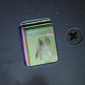
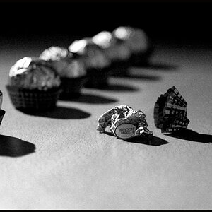
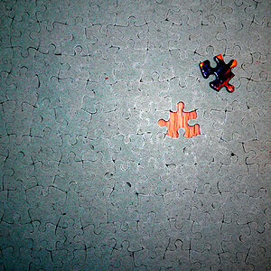
The last two get points for shape and stlye. I don't know about everyone else but as a graphic designer I also have an appreciation for abstract shapes and designs. Sometimes normal things look interesting from a different view point. I can see these pictures being used as a part of logos or stock photography.
 
karrissa! i do like yor #1 picture !
...and a second thing...you are the first woman in the world i know, which is taking pics of engines, just like me!!!(some time ago i was almost crazy about it -;)))
this is so weird!!!
i never thougt i,ve met someone ho takes pics of engines!!! -:))))

ah...and forgive my english...
 
That park shot is the tops, but... a six second hand-held shot? Can you say nerves of steel?? :thumbsup:
 
anua said:
you are the first woman in the world i know, which is taking pics of engines, just like me!!!(some time ago i was almost crazy about it -;)))

My dad is a mechanic and well... you take picts of what you can. :)

photobug said:
That park shot is the tops, but... a six second hand-held shot? Can you say nerves of steel?? :thumbsup:

Actually, I braced my hand and camera on some parts around the rest of the car... never the less... I surprised even myself. :shock:
 
It took until I had read Shark's reply to your photos, karissa, that I really saw the dark blue in your first photo. At a first glance it had seemed black, black, more black - and then the lighted scene. Which I found quite intriguing in itself, I must admit. I instantly liked that one best of the four. But after I've had a second look at it, looking for that dark blue sky specifically, and after I have finally detected that dark blue sky, I like it even better! I like the composition, and this - for a change - is one where the plenty of dark space gives a meaning to the light space in the corner.

The office pic is too dark for my liking, but that may be because of my shitty monitor (it must be shitty for I see very little of those details that others sometimes point out in photos... :roll:).

And I do see why you are proud at the 6sec. exposure of your car engine, hand-held! WOW.
Not that car engines or brakes would carry a great meaning to ME (all mysterious they are...), but I quite like the shape, mostly so of the engine. And the colour - much resembles the one I had in my old VW Golf. The one in my new car looks different though.
 

Most reactions

Back
Top