er111a
TPF Noob!
- Joined
- Jan 30, 2008
- Messages
- 1,896
- Reaction score
- 6
- Location
- Virginia
- Website
- er111a.blogspot.com
- Can others edit my Photos
- Photos OK to edit

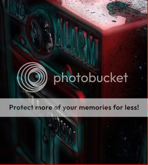
what yall think?
Follow along with the video below to see how to install our site as a web app on your home screen.

Note: This feature currently requires accessing the site using the built-in Safari browser.

anyone else?Try cropping ALL the black space on the left out, and see what you get.
anyone else?Try cropping ALL the black space on the left out, and see what you get.
anyone else?Try cropping ALL the black space on the left out, and see what you get.
Try cropping it, post that, and see what people think.
It's a style choice.Seems over-processed.
How does that help?me neither
sorry took me some time here it isIt's a style choice.Seems over-processed.
It's creative.
He's thinking out of the box more than anyone in this forum.
The art of photography can be more than just "perfect exposure".
I like the the heavy tweak here. I like the contrasting glow it gives.
It kind of gives a sense of, well, alarm.
This guy has had a pretty shaky go in this forum, and took a lot of abuse.
I finally see where his thought process lies, and I for one can appreciate his point of view.
The composition on this image is poor, and detracts from the subject.
I wish the OP would take my suggestion, and look for a better crop, and share that.
How does that help?me neither
What don't you like? What could make it better?
Learning to give better critiques, also helps YOU as a photographer.

hahahaha ok i get what your saying we all have things we likei'm gonna tell you why i don't like it.
i don't like the colours, nor the angle or the subject that's being photographed. it just doesn't make any sense to me, it's too weird of a shot