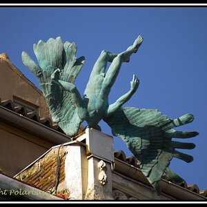
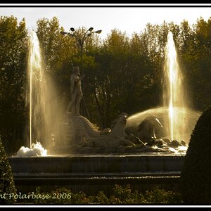
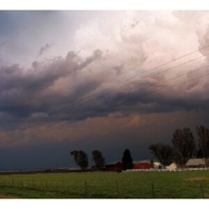
Very nice images.
One thing that does disturb me is that the artists name is square in the middle of the picture though.
I know, that protecting ones images is vital, but just think that if the signature is on the corner (so out of the way of the actual focus of the image) it would be less distracting.

")
![[No title]](/data/xfmg/thumbnail/37/37110-1d5d98524f9f6a8623703161610ef439.jpg?1619737882)
![[No title]](/data/xfmg/thumbnail/40/40304-a0ff25efbc1737761e8c4d43e2caa085.jpg?1619739412)
![[No title]](/data/xfmg/thumbnail/37/37109-62e1b65e6f8bd2a349250acd6d653f1e.jpg?1619737882)
![[No title]](/data/xfmg/thumbnail/40/40302-79b0636c0b67a1ed65f8ad9e01c690e7.jpg?1619739412)
![[No title]](/data/xfmg/thumbnail/37/37108-62307f01c11ef92f5655ed4501d565ce.jpg?1619737882)