First attempt at black and white

DSLR noob

TPF Noob!
Joined
Feb 7, 2007
Messages
1,527
Reaction score
9
Location
Atlanta, GA
Website
www.myspace.com
Can others edit my Photos
Photos OK to edit
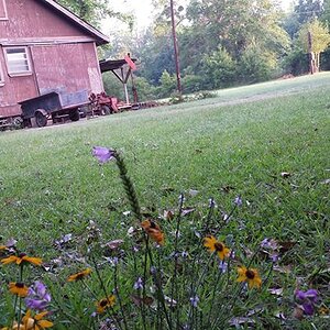
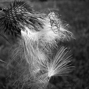
This was kind of a test shot to see how the black and white setting looked. I DID compose, wasn't just a snapshot. There was smoke from a wildfire that's been burning for 3 weeks about 250 miles away that gave this foggy look. I think it just looks so interesting. No post processing. Well me what I can do to improve it via photoshop CS2 or the next time I look through a viewfinder.

IMG_0056-1.jpg
 
I don't know, maybe it just appealed to me because this street is normally INSANELY busy, and I captured it looking eerie to me. Maybe it's total crap. Any takers for help though? anyone?
 
I like the idea, but that 'All You Can Eat' sign is driving me crazy. It's magnetic - no matter what I do that's where my eyes wind up.

The parallel curves give it a nice flow.
 
I like the idea, but that 'All You Can Eat' sign is driving me crazy. It's magnetic - no matter what I do that's where my eyes wind up.

The parallel curves give it a nice flow.

I noticed the same thing I had to read it and ever since then it just where my eyes go!
 
Yeah I hate it. Would it help to clone out the "all you can eat"? I can't do the whole sign but would it help? I wish I could've taken the darn thing down when I was taking the picture.
 
Edit: crop and border. No touching the image. I don't really know what to do to work on black and whites.
I might play with contrast and such later.
IMG_0056-2.jpg
 
ugh it centered the trees! It probably just won't work with this location. a shame because it looks so good in the rest of the photo.
 
You might try just burning the sign a bit to darken it. The problem may be that it's just too bright compared to the rest of the photo.
 
Thanks for that advice. I think it really helped me save the photo. the sign is much less distracting. still distracting, but less so.

blackandwhiteedit.jpg
 
Really I just think the curve of the line of trees puts you where that sign is. I don't think there is anything you can do about it.
 
The black tree in the top corner is very distracting for me, that is where my eye is drawn when my eye should be drawn down the street.
 
Hi!! ok for me the mood is working, but the sign has got to go lol... Dr. Clone.... Also the tree mentioned above is somewhat distracting from the nice road curve,, you might even want to consider a pano on this crop to eliminate a lot of it, thats up to you..
The smoky look works well, with this, I think overall its a pretty nice B+W here..
 

Most reactions

Back
Top