First attempts at Portraits. C&C please.

CameronDelray

TPF Noob!
Joined
Sep 27, 2008
Messages
62
Reaction score
0
Location
Florida
Can others edit my Photos
Photos NOT OK to edit
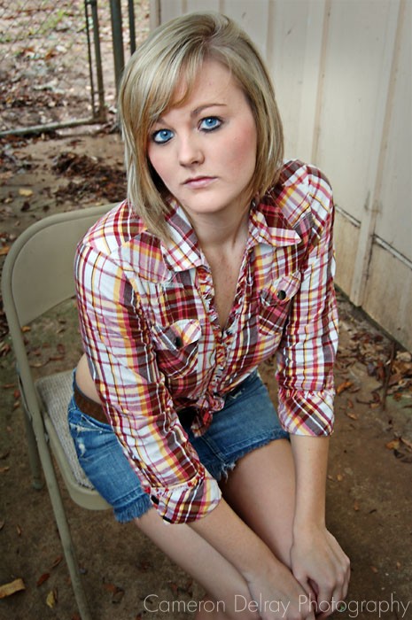
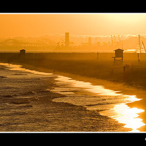
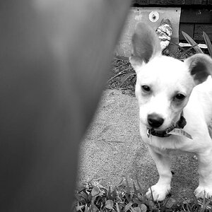
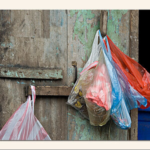
My first attempts at doing portraits.
C&C please. Rip 'em apart, ladies and gents. Thanks!

1.)
2930392522_3ca2236bcf_o.jpg


2.)
2930391844_7ff53a766b_o.jpg


3.)
2929532631_0142e082a8_o.jpg
 
C&C per req:

Quite the dichotomy here. You've got a very pretty model, and you've done very well on couple of the most difficult aspects of portraiture, that is sharp eyes and good lighting. However there's one area where your images, to be polite, fall down, flat on their face. Backgrounds. In all cases the backgrounds are messy, distracting and really detract from the picture. Even if you're very limited in your choices, a plain, light-coloured wall would work. In general, try and look for homogenous backgrounds with a darker, contrasting tone to that the of the model and his/her clothing. That's all minor however, since location is easily fixed.

Just my $00.02 worth - your mileage may vary.

~John
 
So is that all that needs work? The backgrounds?
I can understand about the third pictures, POSSIBLY the second, but I absolutely love the background in the first one.

In your opinion, what would make a good background? Trees, leaves, and the like aren't good backgrounds?

Like I said, I'm new to portraits (actually photography all-together), so what should I look for in a good background? Or should I do something with it in PP? Like darkening it?

Thanks.
 
since you like the first one a lot, and have trouble w/ understanding the background problem, ill offer my uneducated .02 on just that one.

to me the background would be fine if you were shooting a photo of a kid or someone in a more casual tone. What bothers me about it is that you have this pretty girl who is in a dress and pearls, who appears to be glowing radiantly w/ grace and beauty, and her background is a chainlink fence w/ leaves on cement, and an old basketball on the ground. does that honestly sound like it goes well together, to you?

the 2nd one is easier to ignore the background, because she is less formal.

the 3rd i think seems forced. pose and shot.

the model IS beautiful though, and you did a great job of highlighting that, and the exposure on her is perfect, and sharp where it needs to be. like the other person, my only problem would be the background.
 
Ahh I think I see better now.
So the overall PP on the photos are good? That's what I'm most worried about. The thing about this shoot, is she just wanted the pictures taken right outside of her back door. I didn't choose this location. This wasn't technically a "real" shoot, more-as a casual photo-op for her some new MySpace pictures. lol.

If the backgrounds are the only things that are going wrong in these pictures, I'm on the right track, as I can easily fix that in further shoots. I'm more worried about the editing and actual angles of the shots and whatnot.

Thanks for the C&C. :]
 
C&C per req:

Quite the dichotomy here. You've got a very pretty model, and you've done very well on couple of the most difficult aspects of portraiture, that is sharp eyes and good lighting. However there's one area where your images, to be polite, fall down, flat on their face. Backgrounds. In all cases the backgrounds are messy, distracting and really detract from the picture. Even if you're very limited in your choices, a plain, light-coloured wall would work. In general, try and look for homogenous backgrounds with a darker, contrasting tone to that the of the model and his/her clothing. That's all minor however, since location is easily fixed.

Just my $00.02 worth - your mileage may vary.

~John

That, is, in my opinion, a suggestion for a suitable background. Since photography is largely subjective, if those backgrounds work for you, that's fine. Personally, I don't see the attraction in a chain-link fence, dead leaves, and concrete, but that's me. With respect to other points on your image, I'd say you've done well, but your not at the "all it needs is a different background" stage by an means, and nor are most photographers (myself most definitely included). There is always something we can do to improve our work. I chose to comment spefically on backgrounds, since, they were, in my opinion, the major issue with the images.

Your post isn't bad, however I'm hesitant to make too many comments on it, since my already crappy work monitor seems to be going further downhill. A couple of things that I notice is that in 1 and 2, her face seems a little soft; thay may be slightly over-zealous post or it may be that the point of focus wasn't bang on. Also in #2 her faces seems a little whiter than in 1 or 3.

As far as poses go, in #1, she's too close to the RH edge. If you're going to shoot portraits in landscape aspect (and that's fine) just make sure you don't jam the subject all the way over to one side and waste a large amount of the frame on empy space. Also be careful when composing / cropping to avoid cutting little bits of limbs off. If you need to cut / crop a limb that's fine, but don't do it near a joint, don't bisect limbs along a longitudal axis (left shoulder image #1), and avoid little bits being cut (right hand fingers #s 2, 3).

Again, just my $00.02 worth - your mileage may (and probably will) vary.

~John
 
I, in no way shape or form, said these pictures were perfect aside from the backgrounds. Some of you guys get entirely too edgy and over-the-top.

Yes, I realize the backgrounds probably aren't the best. But hey, she chose them, she loved them, she's the one paying me money. I do what makes my subjects happy. After all, they are the ones purchasing my time.

However, I am not a technical completely professional photographer that is going to think the WHOLE shot is blown because 2 or 3 fingers are cut off on the bottom of the photo that has no attention being drawn to them whatsoever. Who knows, maybe one day I'll will be a complete professional, and align a perfect shot every time. Maybe I won't.

I am new to photography, and I had to throw a couple photos from this shoot out because I got the focusing wrong. So, I'm sure 1 and 2 have somewhat to do with the focusing being off a smidge. That's something I'll perfect with a little time and practice. I am honestly VERY impressed by my work, as this is the first portraits I've ever done, much less only the THIRD time using a DSLR camera fully manual. (Actually, I've only owned ONE point and shoot camera, so I'm basically new to taking pictures all-together).

I appreciate the comments and suggestions you have given me, as I know they will help me as I grow in photography, but ease up a little and don't be so argumentative. You said the backgrounds were garbage, I said I see your point but she chose them and really liked them, and you came back again to say the same thing you said your first post. She's the one paying me, so she gets what she wants.

This forum isn't very welcoming to beginners, is it? There are better ways to offer suggestions and comments rather than the way you went about doing it. Instead of smashing one's work, you could simply state what was very well done in the pictures, what 'in your opinion' could very well be changed to better the photo, and offer a way that they could go about doing it. You did all of that, and I thank you, but you also came back repeating yourself after I heard you the first time.

Anyways, I'm done with my rant.
Thanks Dionysus for the help on the backgrounds.
C&C is done on these photos unless you have something to say OTHER that what has already been mentioned. Thanks.

dude, are you being serious? You posted "C&C", what did you expect to hear? "OMG AWESOME WORK!!!" Nope. You gotta earn it. People are being honest, and thats ultimately what will make you a better photographer.

You came in here wanting constructive criticism and you received it. Lets call a spade a spade, the backgrounds are generally not very pleasant. Sure you can pass it off as "artsy" by saying there is a juxtaposition of beauty vs. the beast (the backgrounds, or her living conditions) but thats stretching it.

Beauty is subjective, but the pose in #3 looks forced and it looks like there was no thought put into the locations/backgrounds. Sure she could like the photos, but you couldve definitely put more thought into it. Of all the beautiful locales in FL, you couldve def. came up with better.

If she paid for your services, i think you owe it to her to shoot some more photos. Maybe not around her house?

Just my .02 tho. :hug::
 
Hey, try not to be overly sensitive when someone gives you what you asked for -- C&C.........

Try to look at your own work objectively. You will learn so much from the people here. I have posted things that people have commented on, and I don't look at those comments as being "mean." I have gained a little more knowledge from every photograph that has been commented on.

And when they actually say something NICE about one of my photographs, I welcome that, too!! HA

So, try to take what people say and LEARN from it. Yes, cutting of the fingers DOES make the picture a little less professional. the normal every day person might not notice it, but if you really want to be a professional photographer (which I do not!!), you will learn from these little things that you may now consider nit-picking. Every little thing will help you grow and learn as you go.......

So, be very appreciative of the comments you receive on this board. At least people are taking the time to make the comments. And you will learn. And that's the important part.

Just my 2-cents.

Kimber
 
C&C please. Rip 'em apart, ladies and gents.

I think you got exactly what you requested there my friend. It's not like Tirediron was coming from a high and mighty position, he admits clearly that his work is by no means perfect either.
 
I didn't read through all the responce, I think they are really good but agree about the backgrounds, it does look like there is a ball coming out of her head in the first one...
 
I agree about backgrounds, but you DID capture your model/subject wonderfully.

Am I the only one that has a problem with the first one as in, all the dead space on the right of the model?
 
First...

C&C please. Rip 'em apart, ladies and gents.

Then...

This forum isn't very welcoming to beginners, is it?

This seems to happen pretty regularly here for some reason. Someone posts up some shots, they get harshly critiqued, then the person replies, "OMG!!1 THIS PLACE IS MEAN!!!" I don't know if they subconsciously think so much of their work that they can't fathom that they could actually get a harsh critique or what, but it's a pretty reoccurring trend here for some reason.

Oh well.

That said, I like your shots, minus the backgrounds. They don't seem to go well with the model at all.
 
At first I thought you were joking...guess not....I'd go B&W on the first..did away with the folding chair on the second...and she looks like she's pole dancing on the 3rd
 
Ok yeah, I did get a little upset, but it was more-so because of him repeating himself after I said "she chose these backgrounds". He continued on about how "they should be changed". I said ok, I realize they are bad, and I can fix that in future shoots, and yet he continued.

For example, Kimber said: "Yes, cutting of the fingers DOES make the picture a little less professional. the normal every day person might not notice it, but if you really want to be a professional photographer (which I do not!!), you will learn from these little things that you may now consider nit-picking."

When I had JUST said I'm not trying to be completely professional.
Also someone said "she paid, treat her with better backgrounds". Yeah, I would, but she WANTED THEM THERE. Read the text I type, people.
Like I said, I appreciate the C&C telling me what you like, and what needs work, but please stop repeating yourself for the sake of argument.

This is not an "argument" thread, so let's either get back on topic, or stop posting.
Once again, thank you for the suggestions and input.
 

Most reactions

Back
Top