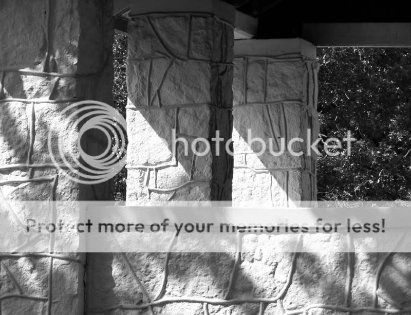
Well, the image is a tad large for viewing on a lot of monitors, so that is one thing to consider. I think resizing to 800x600 is a good start.
I really like the angles from the shadows. Nice use of BW here.
Nice use of light, shadow, straight and also diagonal lines (created by the shadow). When you have straight lines, make sure they are absolutely straight, here it seems like your building is slightly inclined to the right. Just a tiny bit, but it shows.
At very first sight I would have suggested even more contrasts, but I guess that then your whites would blow completely... so better not try that.