Ant
TPF Noob!
OK. I'm ready for my baptism of fire with some serious critique 8)
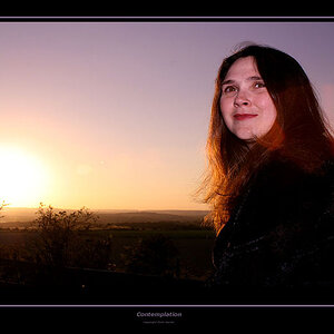
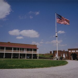
This photo has become one of my favourites and is currently my desktop wallpaper. The only thing I can think of for some improvement is maybe a slight crop on the top and the bottom, other than that I can't see how it can be improved....but then I'm a photo newbie so I'd like your honest input.
Thanks

")

![[No title]](/data/xfmg/thumbnail/42/42276-99df5da06c3e5dc83ae4bab11e935910.jpg?1619740085)

![[No title]](/data/xfmg/thumbnail/37/37526-bc41ead4d3f2330d3e37da95abf9132e.jpg?1619738130)
![[No title]](/data/xfmg/thumbnail/41/41920-c7de4d93604fb89eb48454f9e5dba8a0.jpg?1619739944)