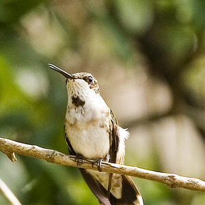
First Landscape

Onyx

TPF Noob!
Joined
Aug 16, 2005
Messages
121
Reaction score
1
Location
Washington
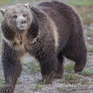
taken with a sony p-10

iso 100 and it doesnt give me controll over anything else so i dont know the other settings.

Id like to know how the composition rates and any other ideas for improvement.
landscape.jpg
 
IMO your composition is excellent. there are many leading lines in this photo but through colors and shapes. i would personally take out a tad of the green in the bottom, maybe make it a little darker to make it a rich green instead of an in-your-face bright green. also might want add some contrast in the sky and burn in a little up there. the dark trees could use some slight dodging as well. i like it. nice one onyx.
 
Personally I would crop some of the green grass off the foreground and I think it would work better if I as the viewer felt I was on that road journeying into that beautiful scenery rather than being on the sideline, pehaps I'm picky? but overall I do like it!!

p.s whoever cut that grass probably got dizzy doing it circular like that :confused:
 
Abstract said:
... and I think it would work better if I as the viewer felt I was on that road journeying into that beautiful scenery rather than being on the sideline, pehaps I'm picky? but overall I do like it!!

Then let's be "picky" together, for that was my immediate feeling as well: I thought "Hey, I'd like to be ON that path, not on the hill above it".

But that is what you have chosen, Onyx, so you could include the faraway background, and that, too, is a good concept.

All in all I find this picture a bit on the bright side, the sky could do with some richer tones, and even though I am renowned for my liking the colour green very much, I do agree that THIS green is a bit much. Cropping it, so that the path comes right out of the corner of your frame would be a first option, I think.

If you then feel like you would want to stay with the custom size of a rectangular image, I would crop in from the left, not the right, just so the eye is lead away a bit from the centre. Rises the "excitement" --- dead-centre photos like those that eydryan seems to prefer are likely to get boring ever so quickly.
 
the sky of the second one with neatimage on it (there is a lot of chromatic noise in it)
and the green of the first one with a little bit more contrast

you could add the photo toi itself and do the product .. then give 50% transparancy on the bottom part
 

Most reactions

New Topics

Back
Top