
Daver123
TPF Noob!
- Joined
- Apr 14, 2009
- Messages
- 23
- Reaction score
- 0
- Location
- Pitt Meadows, BC
- Can others edit my Photos
- Photos OK to edit
Hi everyone, I'm trying to get better at using my DSLR and the whole process of PP and would really appreciate any comments and criticism.
Thanks for looking!
1.
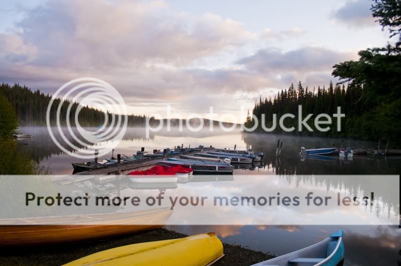
2.
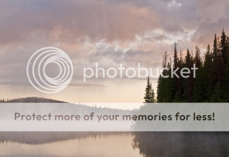
3.
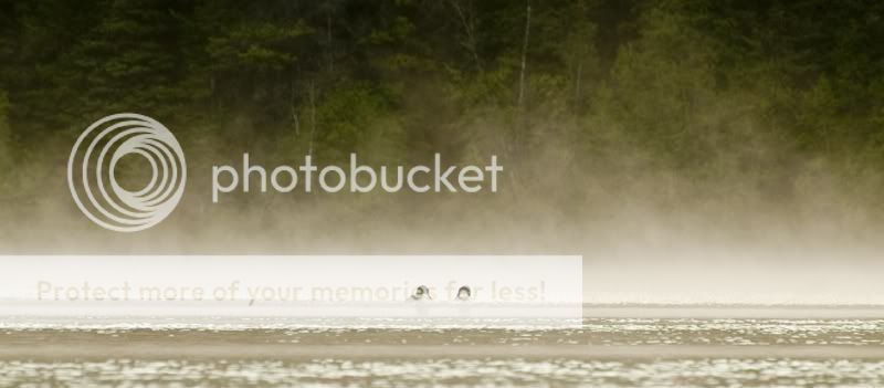
4.

5.

6.
Thanks for looking!
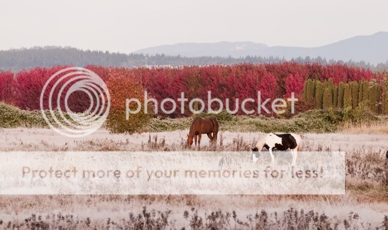
1.
2.
3.
4.
5.
6.
") . Kind of weird that the forest in the foreground is so extremely red. Not sure what you did in post and if it actually looked like this when you shot it.
. Kind of weird that the forest in the foreground is so extremely red. Not sure what you did in post and if it actually looked like this when you shot it.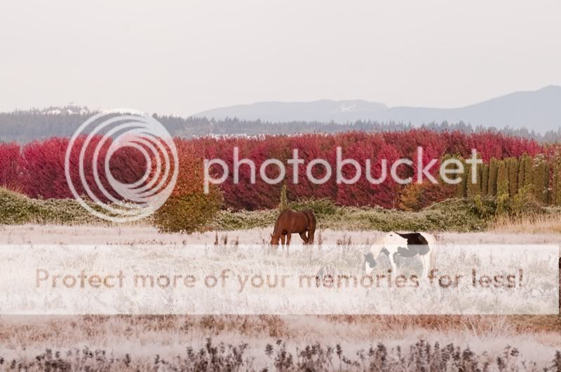
![[No title]](/data/xfmg/thumbnail/41/41765-153b10bab62ae8adbcc4d984fd08ed74.jpg?1619739885)
![[No title]](/data/xfmg/thumbnail/39/39183-f229dae0963376879140c9959e33f935.jpg?1619738903)
![[No title]](/data/xfmg/thumbnail/34/34118-1c18899050bfacc1ed25ac6c1740422b.jpg?1619736288)
![[No title]](/data/xfmg/thumbnail/37/37605-90c8efaef5b7d1f52d4bf8e7dfd33673.jpg?1619738148)
![[No title]](/data/xfmg/thumbnail/35/35966-4f59fb71a71adfe775ae568f8c534699.jpg?1619737283)

![[No title]](/data/xfmg/thumbnail/35/35969-b6f009f356cac5fdbffb0729bddb9e25.jpg?1619737288)