Of you want a comprehensive critique then the poll at the top isn't needed. Just post one preferred but up to 3/4 and people will gladly aid you in improving.
I've moved these to the appropriate gallery forum as the Beginner's Forum isn't intended for critique. As to the images themselves:
1. A nice enough image, but without anything remarkable or stand-out. Flat, even ambient light with no fill has created a clear, shadowless and rather bland look. The use of a small amount of fill light would have shown more eye detail and added just enough shadow for more interest.
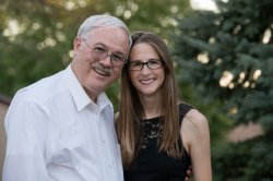
2. Good attempt to use fill lighting here, as well as making sure that the model isn't square to the camera. Unfortunately, it looks like her eyes were processed with some relatively crude "anti red-eye" tool. As well, consider having your models sit a bit more upright. It's good to get them leaning a little toward the camera, but IMO, you've got too much of a good thing there.
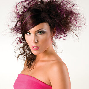
3. I quite like this one. It shows good use of aperture to control DoF (although I have to admit, in this case it's an usual approach...) and the lighting on the main subject is quite good. There's a little bit of detail loss in his shirt front, but overall, the use of fill worked very well here.
4. Pretty much the same as for #1.
Overall not a bad set at all. Lots of little points, but a solid set regardless.
Her face is way too bright from flash, her shoulder is closer to the flash and is even brighter than her face. She is slumped over in an unflattering way.
#4 Tilted, way too much white shirt, dark suit.
It is usually a bad move to shoot pictures of dark faces in white shirt. It will be very difficult to get decent exposures of both.
Straightened it up, warmed it up a bit, brighted it, cropped it to remove as much white shirt and suit as possible, brightened face only


![[No title]](/data/xfmg/thumbnail/37/37606-3c9ffb5906173fa2aa489341967e1468.jpg?1619738148)
![[No title]](/data/xfmg/thumbnail/31/31012-f5e0c7cdea2f2c3e44737e3f61c2461a.jpg?1619734567)