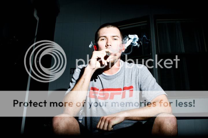
1.
+ Good composition of the subject.
- Overexposed face and I don't like the location. The stuff in the background is kind of disturbing the whole feel of the picture.
2.
+ Good composition in terms of the rule of thirds. Nice fresh green color.
- Kind of random, bland and not "popping" out as a great picture. It's sort of, just a point'n shoot. Would be nice to see more effort put into the picture..
3.
+ ~
- Don't like this.. Way too overexposed.. Or should I say it's wrongly overexposed. Overexposed images can be cool, but it's just not cutting it.
I understand you're going for a mood, but it's not working here.
They are decent. I think the 3rd is better than the first because it seems like you were going for an extreme with the lighting. It's okay to break the mold as far as exposure and all those "rules" go but I'd like to know what you were going for with these shots. They seem like deer in headlights but the expression certainly doesnt match that.
The second is pretty good as far as compositions but it really needs better exposure. You can try bumping it up in PP.
#2 would've been the only keeper for me. 1&3 are merely snap shots; not much consideration for composition in those. In both you're shooting up his nose, nothing too interesting. #1 you're going for rembrandt or split lighting but it's overexposed on the face. #3 is overexposed as well and looks like you blinded him w/ a spotlight. #2 is okay. She could've used a little more light as she has some racoon eyes due to shadows. I would've chosen a more shallow aperture as well.
I absolutely adore number two. The greens are rich and from what I can tell your subject has beautiful red hair. You shouldn't pass that up.
It has some dark overtones, And I would love to see the picture just pop off the screen. The colors could be so vivid and eye catching, I don't think the muting is the best option for the picture.
Other than that, good job. I don't like number three. But number one isn't bad, just not my favorite.


![[No title]](/data/xfmg/thumbnail/30/30990-df3df397f705643bc2c207cc9d579d08.jpg?1619734554)


![[No title]](/data/xfmg/thumbnail/30/30991-43abf4dfee0a54010692c71c43f40981.jpg?1619734555)