First Senior Portraits

Trina

TPF Noob!
Joined
Nov 17, 2006
Messages
12
Reaction score
0
Location
Ferris, TX
Can others edit my Photos
Photos OK to edit
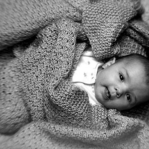
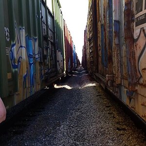
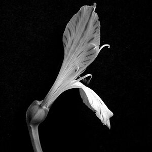
This my first time posting any of my pictures. C&C welcome. I really want to improve my work. Thank you! If they need to be resized please let me know.

1.
l_a4d337d09fc707c0e681302bff13013a.jpg


2.
l_12498113ce6ff938dd6bf2d989233b69.jpg


3.
l_0c567a7cf9a7855e57649028a786e260.jpg


4.
l_07036bb9a0f25270aae6aadeee8abc05.jpg


5.
l_1868a4689a4831d25aa23fc8de14baac.jpg


6.
l_4ba28d855961827cf41524664d74e7ee.jpg


7.
l_02a2313509ee1eea3126c6c6265431f3.jpg
 
No critiques and it's been viewed 33 times. please leave me some criticism so I know where to improve.
 
Hi Trina, welcome to TPF! I think it will be easiest to give some feedback on each photo since you've got a few here. Let me first say that I'm assuming you're fairly new to portrait photography and we've all been there at some point! I hope you'll share more of your work :)

#1 I like her smile and she looks relaxed which is always nice. The bench is cut off and I would suggest increasing your DOF so the backgroud is more out of focus leaving your subject more prominent.

#2 Not crazy about the angle in this one. In general try to avoid shooting up at people as it's not usually flattering.

#3 On this one I would suggest increasing the DOF again to get that background out of focus and bring attention to your subject. It's seems a bit tight at the bottom of the photo

#4 The focus looks off in this one, looks like you got the tree behind her in focus rather than her. (I did this a lot when I was first shooting!)

#5 This is my favorite of the series. I might crop a bit off the top because there's not much going on up there to add interest to the photo. She does have one of those trees in the background coming out of her head though!

#6 I like the tighter crop here vs. in the first one and the black and white is nice as well.

#7 Looks like this one has the same focus issue as #4, seems the trees behind her are in focus.
 
It's hard to give critique with so many images.

Overall they look OK but could use some improvements.

#1. It is tilted to the left and there is more space on the right side than the left, if there is going to be space around her, I'd like to see it in front of her, rather than behind. The pants are too bright and it doesn't help that her leg/foot are really bright as well.

#2. It's nice. I would prefer to be looking down at her, rather than up at her. Her eyes are too dark. Her hands are awkward looking and the logo on her gown looks like she holding cards in her hand.

#3. This one is pretty good but her close hand isn't in an attractive position.

#4. Her face is blurry

#5. This one is pretty good. Nice use of the tree for natural framing. I might go for a tighter crop to eliminate the space on the left side. Her hair looks a bit messy but if that's her style then I guess it's OK.

#6. Great composition on this one.

#7. Her face and especially arm is quite bright...maybe too bright. The pose isn't all that flattering for her.
 
I agreed with Alison on #1 and took the liberty (Hope you dont mind) to fake the shallow DOF. I did it rather quick so there are a few flaws but you get the idea.

l_a4d337d09fc707c0e681302bff13013a.jpg
 
Not to sound harsh, but depth of field is the biggest problem here...you need much more in all of these pics. What camera did you use? More specifically (and I am no expert, but its just what I notice, and what I have picked up from other photogs)...

#1, The pose is waaaay too mechanical and square. She needs some curvature and a better angle.

#2, The cap is cut off, but its not a bad pose. Also needs more color. The white sky doesnt help the composition.

#3, This one is in desparate need of depth of field. And the subject is smack dab in the middle. You didnt cut off the feet, so that is good, but it could be cropped a little more proportionately.

#4, The subject is out of focus. You got the background in focus by accident. Again, the pose looks very strained and unnatural. There is also some blowout in the skin (overexposed).

#5, I dont know, the trees arent working too well here. Everything needs more adjustment in exposure and contrast.

#6, This is the best one out of the bunch IMO. I like the B&W, but again, needs depth of field.

#7, Out of focus again, and not a particularly flattering pose.

Some post processing work needs to be done in all of these to improve, contrast, noise, sharpness, exposure and overall quality.

Again, dont mean to sound harsh, but you need better equipment if you are not using an SLR camera. A point and shoot is not going to do it.

Best Regards,
NJ
 
Hi Trina and welcome to TPF. You're in the right place. Lots of people here that know what they're doing.
And there's me. :lol: But I will try to help. I too think you're on the right way and this is what I think you could do to improve:

In addition to what's been said, the smile on the girl is exactly the same in all the pictures. I think she has a 'the camera is pointing at me, this is my smile' smile. My wife does the same. I think that hurts this series.
In most, the colours could do with a little push. And be aware of where you're shooting. In some, there's a beaten down field of grass...that's not really appealing.
Keep on shooting!


pascal
 
No offence.... but i found those photos actually quiet boring. just my criticism. waaaay too much space and the one with her just like fakely hanging on the lamp post just looked unatrual.
 
and not to mension that when she was hanging on the lamp post..... HER FINGERS WERE STRAIGHT!!!! how can she be hanging onto it if she has no grip? not that she was anyways cuz she wasn't exactly leaning that far.... so if the intesion of the photo was for her to be hanging onto it, try to make it a little more authentic looking and try to add more character.
 
For starters...it's not horrible..:) You have a lot of learning to do....as do I...trust me I'm no where near as perfectly knowledgeable about this stuff as some of these peeps...but great start. You'll get there.
 
Thank you all for your critiques. I definitely know what I need to work on now. Now I just have to find some people to practice on. So my son better be ready for momma to be camera happy with him. lol DOF is definitely my weakness. I really need to work on that.

NJMAN: Thank you for your advice. I see what you are talking about in each of the shots. I'm using a Canon Rebel. And teh lens kit that it came with.

Puscas: I know about the smile. I kept trying to tell her to loosen up some. But of course she's a teen and doesn't listen.

koda-46: About teh lamp post I did want her to seem as if she was really hanging on to it. But she wasn't cooperating very well.

Again thank you all for your advice... It helps me to know what i need to work on. She was pleased with her pictures as was her mother. But they also don't notice some of the things you notice or i noticed after the fact.
 
Which Rebel do you have? Is it digital (XT or XTi)? Even if its an older film Rebel, you have the equipment to take your work to the next level.

As for the lens, there is nothing wrong with the kit lens. You can get very nice shots with a kit lens if you use the camera's custom settings. I recommend using Manual mode and get to know what works and what doesnt work when setting aperture, shutter speed, ISO, and the like.

If you have a digital Rebel, shoot in RAW. It will give you incredible flexibility in post processing, and allow you to bring out the best with the information you have. Practice editing in RAW (Im still learning too!). :wink:

Also, if you dont know the teen very well, try to engage them as much as possible. The more relaxed they are, the more fun they will have and the smiles wont be so forced. They can be a bit self-conscious, which contributes to them sometimes being uptight. It may be a challenge to get them to loosen up, especially if they dont know you very well, but you can rise to the challenge. :)

Best Regards,
NJ
 
I too think number 5 may be the best of the bunch. The sleeveless outfit in the others isn't working. But, back to no. 5. I agree... the tree in the background, a tighter crop, tone done the foreground trees... a pretty nice shot.

Pete
 

Attachments

  • $l_1868a4689a4831d25aa23fc8de14baac.jpg
    $l_1868a4689a4831d25aa23fc8de14baac.jpg
    138.3 KB · Views: 81

Most reactions

Back
Top