First Serious portrait

Corey123

TPF Noob!
Joined
Sep 29, 2008
Messages
35
Reaction score
0
Location
NY
Website
flickr.com
Can others edit my Photos
Photos OK to edit
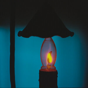
This is the first portrait I ever really made with proper studio lighting.
4214521592_bb571c7420.jpg

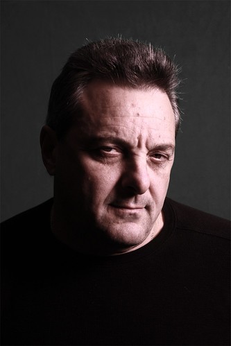
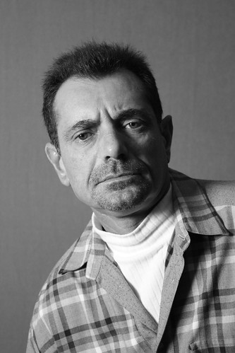
you can view the entire set here Portraits - a set on Flickr
 
I am only going to C&C the one you posted here.
The lighting is good for this style of shot.

It is a good start, but as a whole I do not feel any connection with the subject, it seems like he is looking to your left, as well getting him to lift his chin a bit would have made a big difference to give him a neck.
 
foreheads a bit hot, but overall nice lighting.
 
Light ratios are a little too high for my tastes. Of course if a harsh look was your aim, then you have succeeded.
 
The guy looks quite pink. How does it look on your monitor? To me the skin tone is very far off from acceptable if you were going for a normal-ish look, and not nearly far off enough if you were striving for an outlandish look.
 
I appreciate all of your feedback. I haven't really noticed the neck situation, but I'm definitely going to pay more attention to the subject's head position. Also I agree that even with the soft box, his forehead came out a little overexposed, but I also did a lot of adjustments in photoshop, making the color seem a little more sepia-like, and lightly strengthening the shadows.
Also here's a small example of something that I've done with natural colors, and a more full lighting situation.
4333572709_602fbdd37c.jpg
 
Lighting is too hot, not feeling the black shirt against gray. Light tone looks a lil magentaish too
 
Try using a grey card for correct white balance and exspsure.
 
As others have pointed out the lighting is to hard (well for my personal tastes anyway) and the tones are very pinky. The only other thing I would add is that the subject eyes look lifeless. I would prefer to see some catch lights and a bit more definition to them.
 
With that being my first, here's a similar pic that I took a little later with much better lighting

4232702253_5427911f18.jpg

This guy really enjoyed and respected the process, and I guess it really shows in the final product.
 
I think its a little too dark on his right jawline. The black sweater and grey background just makes it blend too much for me.

I like the lighting on the other b&w.

THe portrait with the green background. I dont like how the sides of his head are brighter than the center of his face. Eyes forehead nose are dark. I'm just guessing its a 2 light. Maybe bring the key more in front of him.

Hope that helps.
-Gian
 

Most reactions

New Topics

Back
Top