
Mohain
TPF Noob!
- Joined
- Dec 29, 2005
- Messages
- 1,863
- Reaction score
- 11
- Location
- London, England.
- Website
- www.gtbphotography.com
- Can others edit my Photos
- Photos OK to edit
Hi,
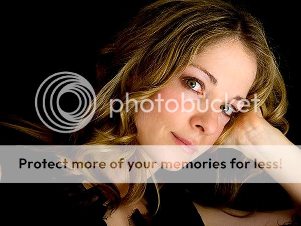
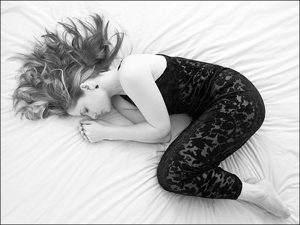
I rarely post in this forum as I've not really done any 'proper' people photography before, just poor attempts at candids. My wife's sister is putting together a promo music CD and asked me if I would take some photos of her to go with it :shock:
Well here's my pick of about 130 RAW shots, taken over the day yesterday. I've not done any processing on these, just very minor tweaks of the RAW (shadows, exposure, brightness) and the B&W conversions are just straight channel mixer with at 100% red, so obviously I can improve on them.
First the images, then the questions.


I don't have any lighting so it's all available light, with reflectors (bits of cardboard) and some with fill-in flash (onboard flash with sock diffuser ).
).
I'd like to be able to get nice skin tones without making it look false. Some of them could do with warming up a bit but in the past I've struggled to keep skin tones natural looking when warming them up. Any tips here?
Also I'd like to go with a high-key look with the 4th one. Any tips for that too?
Also the B&W conversions. Not sure which way to go here for portrait shots. Can anyone give any tip here too please?
Lastly, some general feedback on the images would be nice. I don't have time to reshoot as I'm on holiday for a week from this weekend but hopefully there will be a next time!
I really enjoyed taking these. I hope I can do some more.
Sorry for lots of questions but I'd appreciate any feedback/tisp you can give me as I've got till Saturday to sort these all out!
Many thanks in advance,
Mohain
I rarely post in this forum as I've not really done any 'proper' people photography before, just poor attempts at candids. My wife's sister is putting together a promo music CD and asked me if I would take some photos of her to go with it :shock:
Well here's my pick of about 130 RAW shots, taken over the day yesterday. I've not done any processing on these, just very minor tweaks of the RAW (shadows, exposure, brightness) and the B&W conversions are just straight channel mixer with at 100% red, so obviously I can improve on them.
First the images, then the questions.
I don't have any lighting so it's all available light, with reflectors (bits of cardboard) and some with fill-in flash (onboard flash with sock diffuser
).I'd like to be able to get nice skin tones without making it look false. Some of them could do with warming up a bit but in the past I've struggled to keep skin tones natural looking when warming them up. Any tips here?
Also I'd like to go with a high-key look with the 4th one. Any tips for that too?
Also the B&W conversions. Not sure which way to go here for portrait shots. Can anyone give any tip here too please?
Lastly, some general feedback on the images would be nice. I don't have time to reshoot as I'm on holiday for a week from this weekend but hopefully there will be a next time!
I really enjoyed taking these. I hope I can do some more.
Sorry for lots of questions but I'd appreciate any feedback/tisp you can give me as I've got till Saturday to sort these all out!
Many thanks in advance,
Mohain
") ...... i like all the poses, although i think the second is the least successful of the series.... the lighing looks a little harsh there. There is also quite a bit of shadows in the 5th.... but you could go with that kind of look for that particular image.
...... i like all the poses, although i think the second is the least successful of the series.... the lighing looks a little harsh there. There is also quite a bit of shadows in the 5th.... but you could go with that kind of look for that particular image.


![[No title]](/data/xfmg/thumbnail/36/36099-feb952513e45dbf9f061ab28c1dc1121.jpg?1619737342)
![[No title]](/data/xfmg/thumbnail/31/31011-439c1242fe08cf6b54f32bf06523a567.jpg?1619734567)

![[No title]](/data/xfmg/thumbnail/37/37518-fb05b52482bd05e84fb73316ba1a9c8f.jpg?1619738128)

![[No title]](/data/xfmg/thumbnail/42/42457-a2cc06037a1ecaed84b9f0e5366fa8c7.jpg?1619740191)
![[No title]](/data/xfmg/thumbnail/40/40289-d47f888aadd01e2147ff6cfe4b94f2be.jpg?1619739409)
![[No title]](/data/xfmg/thumbnail/37/37520-d3e4d6582aa2781be7abf64e8651db45.jpg?1619738128)
![http://www.thephotoforum.com/forum/....us/img359/4302/em05017cw4.th.jpg[/IMG][/URL]](https://www.thephotoforum.com/forum/%5BURL=http://img359.imageshack.us/my.php?image=em05017cw4.jpg%5D%5BIMG%5Dhttp://img359.imageshack.us/img359/4302/em05017cw4.th.jpg%5B/IMG%5D%5B/URL%5D)
![http://www.thephotoforum.com/forum/...img389/5730/em05017editur4.th.jpg[/IMG][/URL]](https://www.thephotoforum.com/forum/%5BURL=http://img389.imageshack.us/my.php?image=em05017editur4.jpg%5D%5BIMG%5Dhttp://img389.imageshack.us/img389/5730/em05017editur4.th.jpg%5B/IMG%5D%5B/URL%5D)
![http://www.thephotoforum.com/forum/....us/img181/6885/em02015rh1.th.jpg[/IMG][/URL]](https://www.thephotoforum.com/forum/%5BURL=http://img181.imageshack.us/my.php?image=em02015rh1.jpg%5D%5BIMG%5Dhttp://img181.imageshack.us/img181/6885/em02015rh1.th.jpg%5B/IMG%5D%5B/URL%5D)
![http://www.thephotoforum.com/forum/.../img515/246/em02015editpq1.th.jpg[/IMG][/URL]](https://www.thephotoforum.com/forum/%5BURL=http://img515.imageshack.us/my.php?image=em02015editpq1.jpg%5D%5BIMG%5Dhttp://img515.imageshack.us/img515/246/em02015editpq1.th.jpg%5B/IMG%5D%5B/URL%5D)