First Time: Engagement Shoot (Teaser)

Just got back from vacation, did some more edits this afternoon. Tell me what ya think.

12.
4855581484_f57da68b17_b.jpg


13.
4855579594_8d99faba77_b.jpg


14.
4855583204_b03e4e1e8a_b.jpg
 
I like them all, but I could see the bride not liking #3...really awesome job though.
 
WOW!, the shot with the dog is incredible.
#14 makes her eyes look all jacked up though. It looks like she needs a thought bubble that says "HUR DERP". None of the others do, and they're all quite nice.

Great work!
 
Thanks, and LOL @ her eyes. I didn't even realize that!

I played around with overlays and some gradient mixes on this one. I tried a regular edit on it, then black and white ... it just needed something. Not sure if anyone will like this one b/c of the texture. (It has a vertical gradient layer and texture layer, with opacity set to fit the image)

16.
4855243201_5cb3f0d0ce_b.jpg


17. This one, I just LOVED the edit and shot, it has a strong feeling/storybook look to it. Had to level out the picture first, if anyone cared lol.
4855859402_99c8193851_b.jpg
 
What I like about all of them is the clarity, each shot is clear and sharpness is nice.
 
Man. Your pictures are smoking hot. That texture on #16 was skillful. Not many people can pull off texture.

In all honesty, your post processing skills are paid magazine good. Maybe even Vanity Fair good. No kidding.

How'd you get your post skills so high up there? Lots of youtube? Any particular books you recommend?

Thanks dude, but I wouldn't go as far as to say they are magazine quality lol. The more and more feedback I've been getting on these shots, family, friends, friends of friends whom I don't know ... I think I'm going to start doing this as a little side project of mine. I enjoy the heck out of photoshop and the camera, so it's not 'work' to me. Although, I kinda wish I would have asked for a little payment on this shoot, but I was and still am NEW ... so it's good experience. I've already gotten messaged on fb to do a family portrait, so I'm going to take them up on that offer as soon as I'm done with these edits.

As far as my 'skill', it's all self taught dude. I started playing with photoshop in college, followed a few tutorials here and there, took stuff from there ... experimented with other things and just learned as I went. This is the first time I've used PS for photo manipulation and post editing, I've always used it to add different layers, change backgrounds, filters, etc and mostly on car related stuff on pictures I never took lol. Like I said, that texture on that picture was the first time I've done a texture overlay on a photo. Took me a while and multiple changes/tweaks, but I got it the way I wanted it to lol. I've never read any books on PS or have one site I frequent on it. I would just say to sit and play and practice and experiment on PS, that's the only way I can usually learn. Plus, I've been using computers for a while now, raised on them lol (28 yo.), so I pick up on things computer related rather easily.

I still have A LOT to learn, my pictures are no where near perfect or publish type quality, but THANKS for your comment. You made my night :hugs:
 
She sent me some other photographers websites with different types of edits she wanted, and she wanted some 'vintage' type photos. After a lot of trial and error and google searching, I figured it out .... I think lol.

I love the vintage look you made. How'd you do it?
 
I explained how i did it on the first page ;)
 
#1- I don't mind the sky being blown out as it is still more of a gray than a white (less distracting.) The problem comes into play though that she seems to have a turret growing out of her head :( The moment captured with the two of them is fantastic, so even with that I think it is forgivable.

Editing wise: Skin tones have a touch too much magenta in them, try to bring it back to more of an orange. Is that a vignette? Or are there just really large clouds in the sky? I think the uneven gradation in the sky (either way) could be tuned up a bit.

#2 I would say this is a great shot for the couple, especially if their dog is important to them. The only major critique would be less head room. If this were for me, I'd also probably prefer less busy surroundings (the fence, the buildings, the car, trees, sidewalk/ road)

#3 I love the colors and simplicity of the shot. So far this is the strongest one. Just straighten it up a little (appears to have a tilt to the right)

The only major improvements in my eyes would be to crop in close so that all you see is the couple and the door. A much more dramatic and powerful image (only in theory, it could also ruin the shot. I think it would be worth a try though).

#4 This is a cute shot, I think you called it quits too early though! Closer in, and more centered (I know, you're thinking WTF NEVER CENTER A SUBJECT!!@!@) the difference in this shot is that you could frame it where the couple fall on the thirds and the crowns down the middle. This would distribute weight amongst the image much more evenly and quite possibly allow for better eye flow.

Great shot either way though!

#5 This is what I've been looking for! Great emotion, nice and close, small but needed head room. A little more contrast wouldn't hurt but that is my taste.

#6 Cute, on train tracks (pretty cliche but I know they love it) The only major problem is the post done on this, seems very different from the rest of the series. Not sure how much your branding means to you, or what it even is! But to me if I start in full saturated color I like to end in it as well (B&W is ok, but try to only sprinkle as it is more of a seasoning in this case than the main course)

#7 You were definitely doing something right, they seem to have had a very good time with you. You may have missed the moment (if there was one) where he was looking at the camera, but it is still a nice shot of the two of them.

I think the bright green in the background is distracting and that this may work better as a portrait than landscape. Not sure what you are going for so who really knows but you!

#8 Very cute shot (back to the more hipster style) I like this as the opening shot, more so than the last railroad shot. This one is much more forgiving I think.

#9 This time around much closer in but with lots of head room still. The building doesn't really help them at all so it wouldn't be forgotten. The only problems remaining are the turrets =| Bad tangents.

#10 Very adorable shot, I don't like what is going on with his foot on the bottom left, but in those pants he probably couldn't have rested it on the arm rest. Very good, probably could have been cropped a bit closer.

#11 Here we are back to the more "hipster" look. I really love this one, great depth, looks like they are both having plenty of fun, Good lines and angles all over.

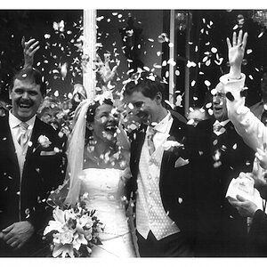
#12 Here is another one that is very classy looking. Him picking her up, simple shot but what pushes it so well is that (wether or not you noticed) her head pops on the overexposed background as does his. Good use of contrast to assure the focus of the viewer goes to the brightest spot then immediately to the both of them.

#13 Breaking all of your previously set up styles, I believe this is another one that could use some editing. The colors don't match anything you have so far, it isn't B&W, it isn't that hipster tone, and the colors aren't popping like the ones with the red door. It is a good shot, just doesn't fit in with the bunch!

#14 Cute, but personally the farther away one works better. Way too much head room again :(

#16 Good, but after accidently seeing the next one I wouldn't even bother showing this one. The editing works except for the desaturation, it doesn't fit in with aging nor does it fully hit B&W. I think you got too hung up with the image needing more work, when it just needed a little more work when being shot (which I think culminates in the next one)

#17 It says it all. Love this photo, this is where #16 lacked, attitude and personality. 16 Wasn't a bad shot, it just doesn't have anything going on compared to this one. The powerful colors, the expressions on their faces, the lines, the repetition, this here is a winner for sure.

It appears you want to stick more with the "hipster" look, I think you should concentrate on the B&W, Hipster (I only call it that since there really isn't a name), and fully saturated images. Three styles aren't too many, but with some of the earlier ones you have four or five going on.

I hope you found this useful ^_- and up to par as you expect from me. Also, I sent you a message but due to horrible internet connection I don't think you got it :( So if not, I said "Of course! Especially after so many compliments :p"
 
Wow man, I seriously love your critiques. They are straight to the point, but never in a negative connotation. Thanks for those!

I'll have to revisit a few of my edits and chalk it up as a learning experience. I totally see your point about the style being all over the place though, I'm learning as I'm going lol.
 
:D No problem, and I really appreciate that you understand how hard it is to critique like that :x. It helps when your school pounds proper critiquing into you with every single class (even english comp and geometry lol).

It is very easy to see a photo's potential and decide to go with a new editing style, I know that all too well! But when you take the extra time and get them all within the same style, it makes the impact of the group so much more powerful! It is very surprising, so good luck with that.

Hope it turns out well :)
 

Most reactions

New Topics

Back
Top