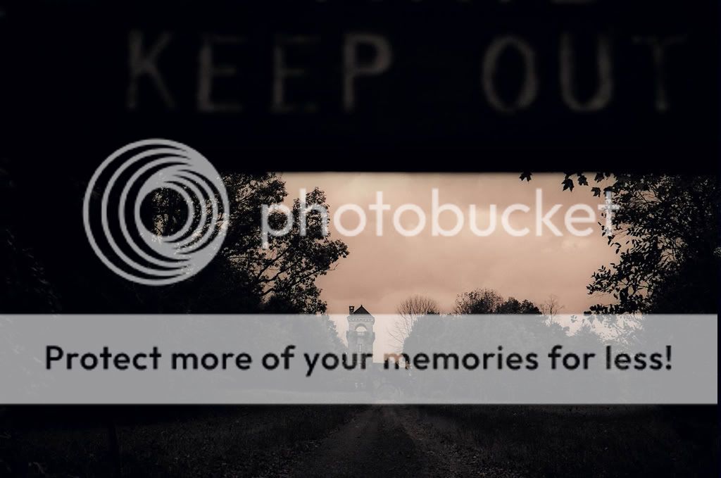
ahh... i didnt see the "Keep Out" sign when i first saw #1 (i was on a tilted laptop) and i must say that does add to it
just brighten it and itll be good =P
I think #1 is neat. It looks as if it needs staightened up a bit, I agree it could be slightly lighter with some detail in the foliage etc. The keep out sign would look better if it was in focus. Still as nice idea though...

![[No title]](/data/xfmg/thumbnail/42/42276-99df5da06c3e5dc83ae4bab11e935910.jpg?1619740085)
![[No title]](/data/xfmg/thumbnail/32/32719-7d42e7d7077540fabb3fa0275a99899a.jpg?1619735625)