RussJasper
TPF Noob!
- Joined
- Sep 3, 2009
- Messages
- 59
- Reaction score
- 0
- Location
- London, Ontario
- Can others edit my Photos
- Photos OK to edit
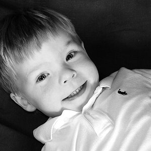
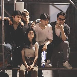
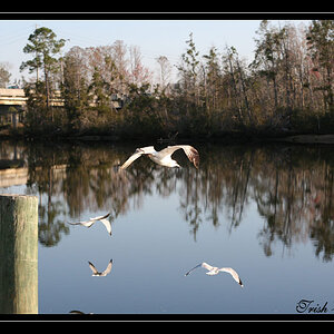
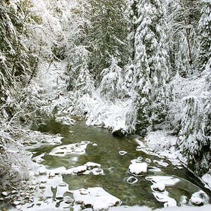
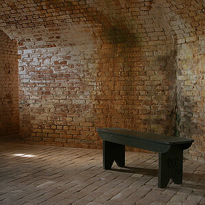
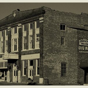
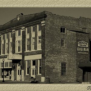
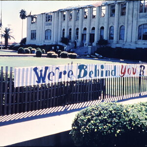
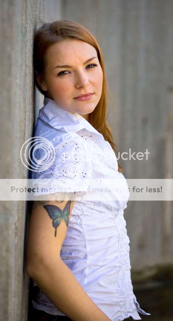
Had the chance to go out with a friend of mine for some pics. Just for practice. I don't have any lights just one speedlite. I need to pick up some better gear thats for sure.
1.
2.

3.

4.

5.

1.
2.
3.
4.
5.


")
![[No title]](/data/xfmg/thumbnail/42/42280-60cc6d4893a2f440eac7dd2248e733a9.jpg?1619740088)