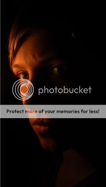
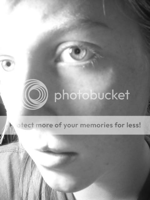
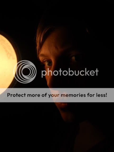
#2 seems out of focus and areas of your face are blown out a good bit. #1 seems like the better shot. Maybe if you play with the white balance a bit and processed it a bit otherwise, you could spruce things up a bit. I would "cool" the photo down by playing with the temperature a bit, unless you were going for a warmer tone.
I agree that #2 is pretty blown out and out of focus. I like the warmer tones in the first one, but it kind of bothers me that the front part of your face is so dark. You can almost see your front eye, but not quite and that back eye just seems so far away to be the focal point. I think its a good self-portrait, I would just lighten up the part of your face closest to us a little bit more. Great start!
_______
I just cropped it and brightened it a bit. The second one i really didnt do anything to it... i changed it a tiny tiny bit but you cant really tell much.
I agree that #2 is pretty blown out and out of focus. I like the warmer tones in the first one, but it kind of bothers me that the front part of your face is so dark. You can almost see your front eye, but not quite and that back eye just seems so far away to be the focal point. I think its a good self-portrait, I would just lighten up the part of your face closest to us a little bit more. Great start!
The eye closest to the camera doesn't necessarily need to be the focal point, but in this case it is hard to see the back eye. I feel like I want to peek around his nose to see it better. Maybe "too far away" was a bad choice of words - more like "too inaccessible". I feel like I shouldn't have to work so hard to see the focal point.
I'm not sure if brightening the image a little will take away from the low-key. I'm not saying to brighten up the whole side of the face a lot, but just enough to make that front eye a little more visible. The way it is right now, it's just distracting to me. He could easily go the other way and darken out the eye altogether, but then I feel like so much of the photo would be dark.
Actually, now that I think about it, I wonder if turning his face just a smidge toward the camera would make all the difference? That back eye wouldn't be blocked by the nose and that front eye would be thrown more into the shadows. With a little more of the back half of the face turned toward the camera there would be more lighted area of the subject to view while still keeping a low-key feel. Thoughts?
The first shot might have been better if you had some sort of reflector to lighten up the left side of your face. But if your intention was really to blot it out with shadow to achieve an aura of mystery, you got it.
The first shot might have been better if you had some sort of reflector to lighten up the left side of your face. But if your intention was really to blot it out with shadow to achieve an aura of mystery, you got it.
Thanks guys! i wasnt really trying to make the left side of my face darker really... but... I was just trying to see if I could get a good self portrait and what my camera could do.. and that was the best picture I got.

")
![[No title]](/data/xfmg/thumbnail/42/42057-1509913128bb1db2bc11235c05832fd4.jpg?1619739993)