First try at Stock Photography - C&C please!

Simons

TPF Noob!
Joined
Dec 18, 2009
Messages
56
Reaction score
0
Location
Cheshire, UK
Can others edit my Photos
Photos OK to edit
Hey

Ive been asked to do some product shots for my parents new website, and decided to do some other sample shots as well trying out the technique.

Im looking for any comments and criticisms you may have.

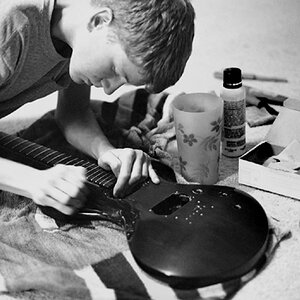
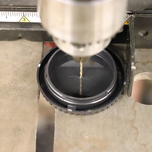
Here are 3 shots i did for the website:
4598593539_7c20a1202d.jpg

4599214118_19efc89302.jpg

4598560967_a018df79fd.jpg


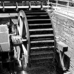
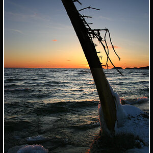
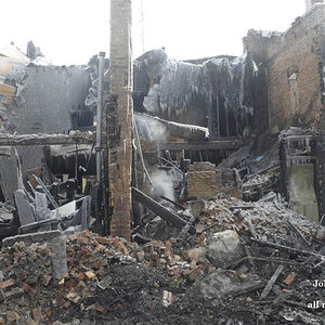
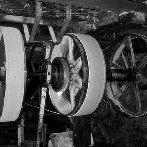
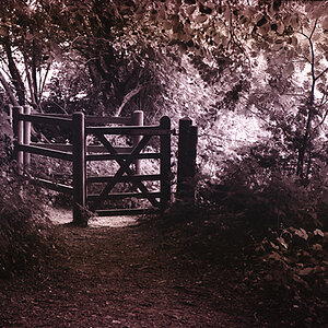
Here are some other sample shots i tried:
4599145156_34708fce91.jpg

4599147206_5a6c906cd8.jpg

4598530783_340783594e.jpg

4598532779_1c10fc44f3.jpg

4598534903_ba0efde642.jpg


Any comments appreciated!

Thanks
Nic
 
Personally I think they are excellent, not much I would change.
 
Pretty good. I would probably add some stronger directional lighting to make the images pop. If you're looking for some more ideas check out David Hobby's strobist.com.
 
Are all the backgrounds supposed to be white? If so, then your white balance is off.

Also, in the second one, some of the paper shreds are sticking out of the closed box. You could probably just clone those out in PP.

The water glass has a slight tilt.

Hope that helps! Your focus looks good, though. Just remember to properly expose (easier said than done, I know) and while they are "stock" photos, you can still PP slightly with a bump in curves or a soft light layer.

ETA: are these sharpened for web?
 
these seem noisy. maybe its just me. But nice shots!
 
these seem noisy. maybe its just me. But nice shots!

Not sure where you're looking, I can't see any noise.


I like the background colour in the first 3 shots, it works well with the product. Aliciaqw; I think that was the OP's intention (though it may have been by accident).
 
4598593539_7c20a1202d.jpg


Any comments appreciated!

Thanks
Nic

A quicky edit. The original is tilted 1° CCW. I selected the item using the pen tool and adjusted the exposure of the background including some cloning. I dodged the side of the box camera right, the under side of the lid, the cup.

Overall the image was underexposed about a stop (ACR, and added some Clarity).

I left the long narrow reflection in the cup alone. but were it me I would lose it, either in post or in my set up for the original shot. It's difficult to tell from a 1 1/4" wide web image but I would guess its a window.

4598593539_7c20a1202d.jpg
 
Last edited:
The pasta and chocolate bar shot are 100% stock photos. Everything else will limit the designer and make his/her job more difficult.

You nicely separated the subject from the clean background with the pasta and the chocolate bar but still the background should be 100% white - very easy for a designer to work with.

For web design you might to think about adding a clipping path as well. This will also help the designer to quickly integrate the product into the design on different backgrounds. Especially in the first three shots.

Photos look focused with proper WB. Not bad.
 

Most reactions

Back
Top