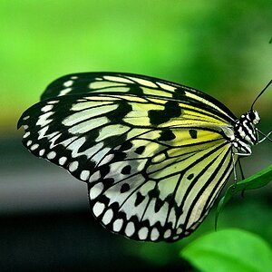
i like the composition and background. color correction looks good to me. the lighting is too visible (glare on the leaves). i recommend softer lighting conditions. daylight works.
I agree. A softer light would be good, there are alot of hard shadows behind the flower. Colors look accurate, but it doesn't 'pop'. Maybe it's me, but I like flowers a bit over-saturated.
To be honest i just dont like the picture itself, i do not think the angle does the flower anything that we havent see before you know? And the things in the background are very distracting, the flower itself is distracting IMO, the shinyness is more interesting then the flower, id ont understand how that shiny aspect worked itself in there.


![[No title]](/data/xfmg/thumbnail/38/38734-a0c4ec46a440db881aca3700b0c62879.jpg?1619738703)