Flowers - C&C

EleanorW

TPF Noob!
Joined
Aug 10, 2009
Messages
271
Reaction score
0
Location
Saskatoon, Saskatchewan
Can others edit my Photos
Photos OK to edit
Hello

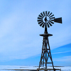
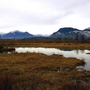
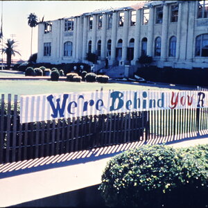
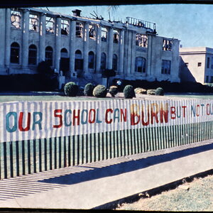
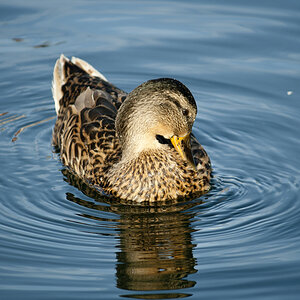
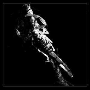
I am attaching the 4 best (to my untrained eye) shots I took last weekend. I'd welcome any critques so I can learn from my errors. Thanks :)

#1
621360180_PwCEf-M.jpg


#2
621360159_pBE3t-M.jpg


#3
621360140_Cj9gZ-M.jpg


#4

621359996_7RiWp-M.jpg
 
Nice set of images. #3 looks very soft from either camera shake or missed focus.

Try to shoot flowers from a different point of view...shots that show the face are pretty standard and boring.

What kind of camera are you using?

What lens were you using?

Do you know the exif (shot settings) for each image? Could you post them?

Did you use a tripod?
 
not really sure about the last three, but the first is absolutely stunning. very sharp and clear. my only gripe (and its extremely small) is that it appears to be a touch too dark and could be just a touch brighter.

...ok, had a second look. im really digging #4 too. very vivid color and was deceptive at first, but it too looks quite sharp.
 
Thanks for the comments guys. Samanax, I have other shots, but figured they weren't as good. I'll post a few more, as they were a bit different for the position of the flowers.

Camera is the Sony a300 and it was the 18-70mm Sony kit lense.
#1 - f5.6, 1/640, iso 100 and aperture priority
#2 - f5.6, 1/500, iso 100 and aperture priority
#3 - f5.6, 1/80, iso 100 and aperture priority
#4 - f7.1 1/800, iso and aperture priority

I was using a tripod, and what you've noticed about the focus is what has me questioning focus earlier in the posts today.
 
chammers - is this what you had in mind? I went back to my raw image and lightened it up just one step.

621583325_J6K3N-M.jpg
 
yah, though it may be personal taste, but to me it seems a lot more "alive" and vibrant.
 
Looking at both of them, my first instinct is I like the first one better (not super fond of bright stuff apparently lol) but looking at the second one, I see what you mean.. it does seem to be more alive.
 
Try taking the exposure down a tiny bit but increase the saturation a bit. Would like to see that pink/lavender in the flower come out a bit more.
 
Try bringing the exposure back up a bit...it looks darker than the original now.
 
I know a lot of you guys don't like selective coloring, but I thought this one would be a good candidate. Let me know what you think.

flower1.jpg
 
Gorgeous flowers. I love the 2nd to last edit of the first one. The bump in saturation really brings out the flower.
 
Not bad short - gives it sort of vintage look. I'll have to learn how to do that stuff. I seem to have forgotten most of what I learned about Photoshop in the 90s :D
 

Most reactions

Back
Top