Fluorescent light – minimalism style – CC if ya want

bigtwinky

No longer a newbie, moving up!
Joined
Oct 6, 2008
Messages
4,821
Reaction score
286
Location
Montreal
Website
www.pierrebphoto.com
Can others edit my Photos
Photos NOT OK to edit
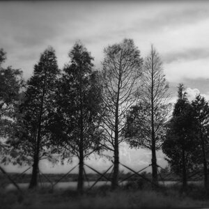
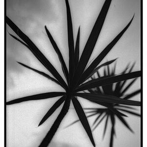
In an effort to try different things, I took this photo with a minimalist style intended...ie something simple and isolated, yet interesting to look at.

20mm, f/4.5, 1/200, ISO400
4097252986_fa6a4e6229_o.jpg
 
You know... I actually dig the hell out of this! Very nice! I may have to play around with the minimalist genre a bit.

Hm... is it just me or is it rotated a few degrees clockwise? I'm staring at it and I feel like it's not quite level...
 
I measured it....yeah, it is crooked...by approximately .35 millimeter when seen on a 2560x 1620 display. I don't have a measuring device graduated fine enough to measure the degree of improper rotation, but it could be (gasp!) as far off as .45, maybe even .65 or maybe even .95 millimeters!
 
I measured it....yeah, it is crooked...by approximately .35 millimeter when seen on a 2560x 1620 display. I don't have a measuring device graduated fine enough to measure the degree of improper rotation, but it could be (gasp!) as far off as .45, maybe even .65 or maybe even .95 millimeters!
It's often hard to tell what someone's tone is over the Internets and my first read this post, was "sarcasm" and not the fun friendly kind, more like mocking those of us who pointed out the slight rotation.

I'm going to assume that you meant the fun friendly kind of sarcasm, though, and just say that the reason I pointed it out is that I REALLY like this image and the ONLY thing that's distracting my enjoyment of it is that slight clockwise rotation that is easily corrected. I meant it constructively because I enjoy this pic and hope that you took it that way.
 
Yes, I meant it as friendly....it is a tiny bit off, but I think also the slightly larger amount of black space on the right hand side is making it look farther off than it is in actuality.

Overall, I think the photo is very cool,and it is in a well-respected tradition of rectangular minimalism, one of the finest practitioners of whom was Piet Mondrian, who kind of established the idea that very minimalist, straight-lined compositions built entirely on right angles could be considered fine art.
 
I agree, it is slightly off. There isnt much post processing on this one other than desaturation with some contrast \ curves all in lightroom.

Thanks for the great critiques guys, much appreciated
 
Yes, I meant it as friendly....it is a tiny bit off, but I think also the slightly larger amount of black space on the right hand side is making it look farther off than it is in actuality.

Overall, I think the photo is very cool,and it is in a well-respected tradition of rectangular minimalism, one of the finest practitioners of whom was Piet Mondrian, who kind of established the idea that very minimalist, straight-lined compositions built entirely on right angles could be considered fine art.
Cool.... and why'd you have to point out the negative space on the sides being asymmetrical? Now I've got two nit-picks distracting my enjoyment of the shot... Damn...
 
great texture on the wall in this shot. even more minimal would be just the wall. but i like this, i can picture an enlargement of it hanging on that very wall. what's it's like in color?
 

Most reactions

New Topics

Back
Top