Friends

DramaDork626

TPF Noob!
Joined
Jun 21, 2005
Messages
294
Reaction score
0
Location
NJ
Website
www.dramadork626.deviantart.com
Olympus digital, outoor (duh), this was taken on a cloudy day, which is why the lighting is a little blah.
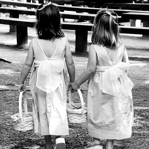
I liked this one cuz it portrays alot of different emotions and thoughts. Thats me, my friend Tom(the boy), and my friend Lissy (in the front). Anyways, i wanna know if theres anything I can do to improve ze coloring?
Friendyfriends.jpg
 
As for the color it doesn't look to bad. Maybe brighten it slightly in the shadows and I would remove just a tad of the red that is showing through on your friends faces.
 
Interesting that one girl has a sad face and the other is happy. I like to see a little bit more legs of the happy girl. If not, then crop the image below the happy face girl waist, because it's distracting to see her sitting like that. This is a great outdoor photo. Maybe less contrast...
 
the colours indeed are good. only thing better would be to remove them :D maybe bw would change the tune because besides the expressions, it looks kinda dull. but i agree with phat1985. the pose is distracting. honestly.
 
I adore this picture It reminds me of my friends. You can tell in each one of the persons faces what there personality is like.:D
 
I'm not a huge fan of the crop...I think a different crop would make it more interesting to me...though at this moment, I can't exactly think of a crop suggestion....and you can barely see the kid in back, and part of his head is cropped off. I do like the idea you were after here. One other nitpik is the background...I keep looking at the diagonal line from the roof of that building.

I'd suggest a re-shoot, and don't crop it in so tight...that way you can experiment with crops...as it is, there isn't much you can do.
 
It looks really cool, colorwise, on my monitor. I'd warm it up somehow, or go with BW.

Simplify the background. I really like the triangle arrangement of the subjects' faces. I think the guy should be farther from the edge, and get a little better placement. If you're going to crop that close to a face it might be better if they were looking into the frame, and other faces were close to teh edge. I think a horizontal crop might work best for the arrangment in this photo. Make the pose taller and tighter for a vertical.
 
I basically am in agreement with a few of the suggestions/opinions. The girl in the front is a bit... crotchy(?) The roof in the background is distracting from your friends.

I definitely like the concept... and it reminds me of my silly friends, as well.
 

Most reactions

New Topics

Back
Top