From a recent shoot

danalec99

TPF Noob!
Joined
Mar 14, 2004
Messages
8,345
Reaction score
69
Can others edit my Photos
Photos NOT OK to edit
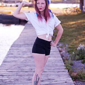
Ignore the text. It's just the name of the shades she was wearing. This is from a model shoot at school. From the little bunch me and my class partner shot, these two (which I shot) are the ones I wanted to share.

_MG_0883twithtext-vi.jpg


_MG_0886twithtext-vi.jpg


::
50mm f1.4, 20D
 
they look great danalec

Makes a refreshing change to see some fashion portrait in the forum.

Most fashion shots are heavily airbrushed, these still have a nice natural feel to them.
 
Love these Dan!
The second one rocks :thumbsup:

There is a light spot in her hair that looks like a bald spot that you might wanna touch up?
 
Thanks guys!

There is a light spot in her hair that looks like a bald spot that you might wanna touch up?
I did notice that too. Since this is not a pro shoot, I thought I'd be a bit laid back.;) Thanks!
 
danalec99 said:
Ignore the text. It's just the name of the shades she was wearing.

I can't! That's the part that's bothering me. It's my commercial background, I suppose. The point is, with the text, it makes the image a photograph of the glasses, and the product just don't stand out enough.

Now you've had a look into my twisted mind.

Pete
 
Christie Photo said:
I can't! That's the part that's bothering me. It's my commercial background, I suppose. The point is, with the text, it makes the image a photograph of the glasses, and the product just don't stand out enough.

Now you've had a look into my twisted mind.

Pete
But would you know that it was the name of the glasses if I had not mentioned it? It was not my intention, in these two frames, to highlight the glasses. If it were the case, I'd have atleast tried to emulate it's font. We are supposed to submit an image with some text on it. And I couldn't think of any better title. :)

Please feel free to be twisted all you want :). It's the honest input/exchange that most of us seek. :thumbsup:

Thanks Pete, Cindy for the wishes and everyone for the input!
 
Excellent work!!!!! The lighting is well thought out. The subject shouts glasses to me. If it is not about them then what are they about?

I can not resist mentioning the text. I love how it is all lower case. The first frame is good, but I do not think it fills the negative space well. Try working with the point size etc. The second shot is great. The text is right in her eye sight. Maybe a touch down and to the left.

Dealing with text can be tough. Hopefully you will only have to do it a couple of times. It is important to know, because at some point an AD will kill your photo with the wrong font or whatever. That is when this assignment will come in handy. Of course it goes a little deeper then that. You get my point

I fully strayed from the subject. Just had to spill my thoughts. Personally I love typography. Um... yeah, I think everyone knows that.
 
craig said:
Personally I love typography.
Likewise here!! :D
Thanks for the input, Craig!


Edit:
Sorry for not responding to your question. I was drained to the core last night.
The subject shouts glasses to me. If it is not about them then what are they about?
Yeah, this could be 'glasses', but my intention in these two shots, was the 'whole picture'. I'm a big fan of playing with spaces. :).
As for highlighting the glasses, and if I had only one shot to convey the message, I'd have moved in closer enough to let the viewer see it's name embossed on the frame or something along those line. I'm not sure! :)
 

Most reactions

Back
Top