I would recommend changing the Font on your title page to a more readable font and a somewhat lower contrast and less bright color while also reducing the density of the drop shadow.
I like the photo's but the website doesn't do them justice as they belong on a better looking site. I would suggest using a simple website maker like wix or weebly yo create a more modern sleek looking site and steer away from grey as the background normally and off white works best.
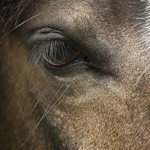
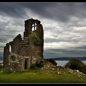
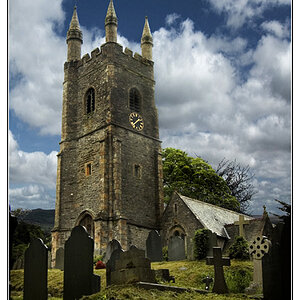
That's my opinion on the site itself but the pictures are great just need to be presented better

")
![[No title]](/data/xfmg/thumbnail/41/41862-7cc80b10f9effd079847b9dd210dbe2a.jpg?1619739925)