Navigation
Install the app
How to install the app on iOS
Follow along with the video below to see how to install our site as a web app on your home screen.

Note: This feature currently requires accessing the site using the built-in Safari browser.
More options
You are using an out of date browser. It may not display this or other websites correctly.
You should upgrade or use an alternative browser.
You should upgrade or use an alternative browser.
Give it to me straight
- Thread starter kayhowell
- Start date
bigtwinky
No longer a newbie, moving up!
- Joined
- Oct 6, 2008
- Messages
- 4,821
- Reaction score
- 286
- Location
- Montreal
- Website
- www.pierrebphoto.com
- Can others edit my Photos
- Photos NOT OK to edit
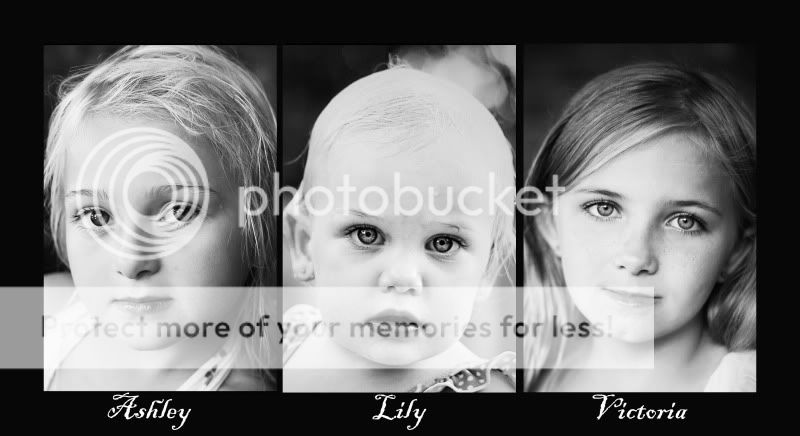
I find its a bit white / over exposed, specially the middle kid.
The left girl has some dark area on her lower lip
You could also take out that bit of water / sweat on the middle kid's forhead, my eyes went straight there.
Nice sharpness though and its a nice set. Not sure on the moody expressions, but if this is what you were going for, nice job
The left girl has some dark area on her lower lip
You could also take out that bit of water / sweat on the middle kid's forhead, my eyes went straight there.
Nice sharpness though and its a nice set. Not sure on the moody expressions, but if this is what you were going for, nice job
benlonghair
TPF Noob!
- Joined
- Jun 1, 2009
- Messages
- 1,072
- Reaction score
- 0
- Location
- Woodstock, CT
- Can others edit my Photos
- Photos OK to edit
I like the concept. Did something similar for my dad for fathers day, but with birds in his front yard. They're all a little over-exposed, to my eye, especially the middle one.
There's also some little spots I'd clean up. Like the dot on the middle ones forehead, the scar or whatever beside the eye of the one on the left, and that one dark eyelash on the bottom of the left one's eye.
The right one seems soft in the lower left corner. Everything else seems sharp, so I wonder if it's an optical illusion.
kayhowell
TPF Noob!
- Joined
- Apr 12, 2008
- Messages
- 26
- Reaction score
- 0
- Can others edit my Photos
- Photos OK to edit
The middle child was lightened up a bit... I wasn't sure if I should try to match the exposures of all three kids or not. Will go back and lower the exposure amount. The spots in most cases are water from the swimming pool. They had just gotten out. I will take them out, no problem. I wanted to do the collage this way (matching expressions) because I thought it would look better this way, now I'm not so sure.... Thanks you guys, sometime it is hard to look at your own work and figure out what is right or not....I am going to make some changes and post another copy. Any other suggestions?
JenLavazza
TPF Noob!
- Joined
- Aug 10, 2009
- Messages
- 379
- Reaction score
- 0
- Location
- Small town USA!
- Website
- www.jenlavazza.com
- Can others edit my Photos
- Photos OK to edit
I like the somewhat somber expressions. I think with those changes mentioned it will look VERY nice!
xiangji
TPF Noob!
- Joined
- Jul 26, 2009
- Messages
- 126
- Reaction score
- 0
- Can others edit my Photos
- Photos NOT OK to edit
To me they're supposed to be "over exposed" I think with the dark backgrounds and details on the hair and the eyes it's a nice piece :thumbup:
I think some people see (slight) over exposure and start ranting about it negitively... if you think all your shots must be perfectly exposed every time... it's a bit sad I recon.
Nice job anywho :thumbup: =D
I think some people see (slight) over exposure and start ranting about it negitively... if you think all your shots must be perfectly exposed every time... it's a bit sad I recon.
Nice job anywho :thumbup: =D
bigtwinky
No longer a newbie, moving up!
- Joined
- Oct 6, 2008
- Messages
- 4,821
- Reaction score
- 286
- Location
- Montreal
- Website
- www.pierrebphoto.com
- Can others edit my Photos
- Photos NOT OK to edit
To me they're supposed to be "over exposed" I think with the dark backgrounds and details on the hair and the eyes it's a nice piece :thumbup:
I think some people see (slight) over exposure and start ranting about it negitively... if you think all your shots must be perfectly exposed every time... it's a bit sad I recon.
Nice job anywho :thumbup: =D
I agree with you on principle. Just as a rule of thirds is meant to be broken when you have the right subject, I sometimes see under and over exposed images that are great and would not work as well if they were properly exposed.
But I don't find that this set is a set that fits that category. You can maybe get by with the side girls with some over exposure, but I find it is distracting for the middle girl.
Could be the lack of dark hair, the fact that there is a bright spot above each of her shoulders / under the ears where the other two dont have, and when over exposed, these make the face look even more over exposed.
Contrast is good, but to a certain degree and photo dependant
So yeah, time and place for everything. And its all a matter of opinion
ANDS!
No longer a newbie, moving up!
- Joined
- Nov 14, 2006
- Messages
- 2,178
- Reaction score
- 3
- Location
- Downtown
- Can others edit my Photos
- Photos OK to edit
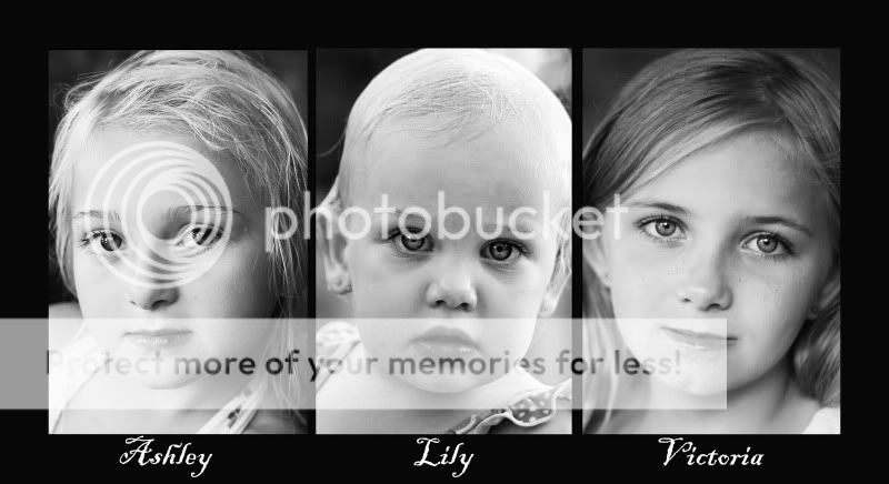
I think what some may be referring to as "needing to be overexposed" is in reference to wanting a High Key look to their piece; but high key does not necessarily mean over-exposed (in fact it doesn't). I would bring the exposure down a bit, even it out a tad, and maybe tweak the contrast settings if you want a more stark black and white look.
kayhowell
TPF Noob!
- Joined
- Apr 12, 2008
- Messages
- 26
- Reaction score
- 0
- Can others edit my Photos
- Photos OK to edit
was going for a high key look but maybe it was a little too high key? Lily's (the one in the middle) hair looked so blown out. I do have to say that this child has the whitest hair I have ever seen. It is just beautiful. These children are family members (my cousin's children). The photos were shot very informally and last minute just kinda "Hey sit there and let me take your picture... I am planning to print this out for their mother (who is dying to see it).
Sorry about the other post. Didn't know the photo didn't post... Here it is! Please let me know if this is better....
Sorry about the other post. Didn't know the photo didn't post... Here it is! Please let me know if this is better....
djacobox372
No longer a newbie, moving up!
- Joined
- May 4, 2008
- Messages
- 2,925
- Reaction score
- 129
- Location
- Seattle, WA
- Website
- djacob372.deviantart.com
- Can others edit my Photos
- Photos NOT OK to edit
I would rotate the third photo a bit to the left so that it doesn't have such a distracting spacial relationship with the middle photo.
JerryPH
No longer a newbie, moving up!
- Joined
- Oct 14, 2007
- Messages
- 6,111
- Reaction score
- 15
- Location
- Montreal, QC, Canada
- Can others edit my Photos
- Photos NOT OK to edit
It's nice but room for a lot of improvement. The high-key look is nice, but you are lacking in consistency from shot to shot. One item to reference is the sharpness of the eyes and faces is way different from shot to shot. A second would be the framing or cropping of the 3 girls.
A third difference is the lighting. In a collage, you are trying to bring out symmetry, and that is not easy if your style is not the same from picture to picture within the collage itself... becuase of this, small differences tend to stand out a LOT, and I find that more detrimental than positive.
A third difference is the lighting. In a collage, you are trying to bring out symmetry, and that is not easy if your style is not the same from picture to picture within the collage itself... becuase of this, small differences tend to stand out a LOT, and I find that more detrimental than positive.
SrBiscuit
TPF Noob!
- Joined
- Apr 22, 2008
- Messages
- 2,716
- Reaction score
- 44
- Location
- NH
- Can others edit my Photos
- Photos OK to edit
i agree...the last edit looks the best, but i think the image on the right needs to be made a bit higher-key...it seems that it is slightly flatter in tone than the others. maybe a contrast or level bump as well?
Most reactions
-
 392
392 -
 300
300 -
 275
275 -
 270
270 -
 255
255 -
 207
207 -
 191
191 -
 179
179 -
 170
170 -
 158
158 -
 140
140 -
 136
136 -
 126
126 -
 121
121 -
 95
95
Similar threads
- Replies
- 19
- Views
- 2K
- Replies
- 3
- Views
- 624