Gorgeous Girl I Went To Highschool With!

JMLPictures

TPF Noob!
Joined
Nov 26, 2009
Messages
133
Reaction score
0
Location
Phoenix Arizona
Website
www.jmlpictures.com
Can others edit my Photos
Photos NOT OK to edit
Let me know what you think!
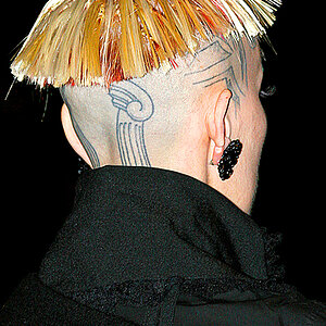
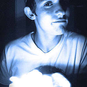
1
stacia-1.jpg


2
stacia-17.jpg


3
stacia-32.jpg


4
stacia-46.jpg


5
stacia-47.jpg


6
stacia-52.jpg


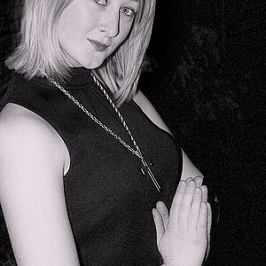
I tried to even out the light a little better on the higher lighting ratio shots like people have been telling me I need to work on.

Also I do realize that on picture #5 her boots do blend in with the background... i should have added a little extra light to them. Always learning though!

Josh
 
Well they are pretty dark, not enough light, and the eyes are not sharp in most of them.
Number 4 is the best of the lot.
 
I am all for C&C but how are they to dark? The black and white ones are supposed to be that dark. The others are correct exposure. And on my monitor the eyes all look in focus. Is my monitor really that screwed up?

Not trying to sound mad but it seems like if anyone does anything at ALL outside of the norm on this site people think it's just all wrong. IDK

Josh
 
This is not outside of the norm...I see photos with this type of lighting scheme all the time....just done better.
Take a look at the Model Mayhem site...there are a lot of examples of the type of lighting you are trying to pull off here...looking at examples of how to do it properly will help you much more than me going through and nit picking the photos....especially since you are already mad and are not open to further critique....and I don't care enough to argue with you about it.
Of course if you think they are great just hold onto that.
 
Im not mad and am not closed minded about any C&C. I have looked at a lot of pictures on that site and apparently i am not getting it. What needs to be different? How bright do they need to be compared to what they are? Feel free to edit these if you want (I know you won't be able to get it to show up as good as re-shooting but maybe you can get it closer to what they should be?)

Like I said. Im not trying to come across as mad. I am just wanting to learn more but need some more guidance.

Apologies for coming across harshly.

Josh
 
I am all for C&C but how are they to dark? The black and white ones are supposed to be that dark. The others are correct exposure. And on my monitor the eyes all look in focus. Is my monitor really that screwed up?

Not trying to sound mad but it seems like if anyone does anything at ALL outside of the norm on this site people think it's just all wrong. IDK

Josh

Outside the norm is fine, as long as it works.

The colour images look ok for exposure. I'm not liking the hair covering her eye (or being close to). The eyes are not sharp as well in 2 and 3.

I find the BW is too dark. Her boots have next to no texture in them in 5 and they get lost in the background. Same goes with the left side of her head in 6. If this was the intent, then it worked, I just don't like the results. Note that I'm at work on an uncalibrated monitor, which can cause blacks to seem blacker.

Composition wise, I like most of them. In 4, I'm not liking how a little bit of her elbow is showing, I find it removes from the more dramatic pose (which I like). I'm also not liking the composition or more the centered subject in 5, but I am really digging the composition in 6
 
Ok... Thank you for that bigtwinky. (This is the kind of critique I am like to get). Tell me in more detail whats wrong. LOL

I did mention that in 5 her boots where too dark. That one I know I messed up. The rest of the black & whites are supposed to be around where they are... im wondering what these are looking like on a calibrated monitor. Mine is not calibrated (don't have the money for one).

Shockey, are you using one? Just curious.

A question about the sharpness of her eyes... Im looking at it at 100% right now on my computer and they do look sharp. What would cause them not to be in the smaller version? I can upload a full res to show you what Im talking about if you want me to.

Josh
 
C + C is inseparable from personal taste, so always take it with that particular serving of salt.

I like shots one, two, and six. The closed-eye shot seems more of an accidental frame than a pose, and the dark one without boots may as well be cropped more tightly to a 3/4 shot. Also, in that shot, I would find it more aesthetically pleasing if her pelvis was rotated back and her spine straight, but I know the hip-forward pose is fashionable right now (Thank You, American Apparel, *ahem*)
 
Last edited by a moderator:
...btw, I find posing a model infinitely more difficult than getting the shot. I always know what I would have preferred afterward when I'm at home in front of the computer, but in the moment I still lack directing practice.
 
#1 is badass.
i love extreme crops like that. very cool.

JML, the darkness tends to become an issue when parts of the model seemingly disappear into the background, imo.
this is most evident in 5. i assume she was wearing black boots, but you'd never know since they disappear. same thing with her arm, and a whole leg is missing.
like flatline said...just an opinion, so it;s not gospel :D
 
She is gorgeous and the shots are great.
I find no fault with lighting or exposure, suits the pics model and mood in each
and the eyes closed shot evokes a mood and that's what it's about!
 
Her eye on #4 looks partially opened.
 
...btw, I find posing a model infinitely more difficult than getting the shot. I always know what I would have preferred afterward when I'm at home in front of the computer, but in the moment I still lack directing practice.

Amen. I struggle with hind-sight when working with people. I find people infinitely more interesting as subject matter, but as the photographer, I prefer Apples. :)

I would be proud to call those my own. Learning bruises and all.


Cheers!
 

Most reactions

Back
Top