Moscovite
TPF Noob!
...run past you folks. Including a link, so that noone is offended...
http://i6.ebayimg.com/05/i/08/8b/22/92_10.JPG
Got some great ideas yesterday on the other thread ( http://www.thephotoforum.com/forum/showthread.php?t=60882 )
so I wanted to pick your guys brains on a few more. Thanks in advance, by the way!
PS: Do you think I can just list this pic, or is a link necessary?
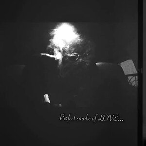
![[No title]](/data/xfmg/thumbnail/37/37627-c3d3ca879cdfbdb9e35acdcc7fcd4b3e.jpg?1619738154)
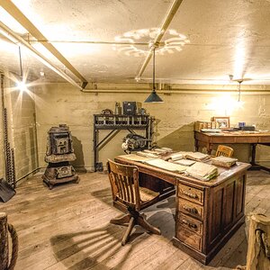
![[No title]](/data/xfmg/thumbnail/37/37630-10bda987ab220dc60e7c1cb65502f83c.jpg?1619738155)

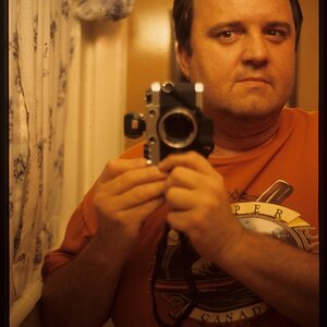
![[No title]](/data/xfmg/thumbnail/36/36299-468f060314a0ac2bf5e37da1c33149d2.jpg?1619737493)