Green Bridge and Dock Night Scene

Nytmair

TPF Noob!
Joined
Nov 25, 2003
Messages
2,388
Reaction score
8
Location
Buffalo, NY
Website
www.km3k.com
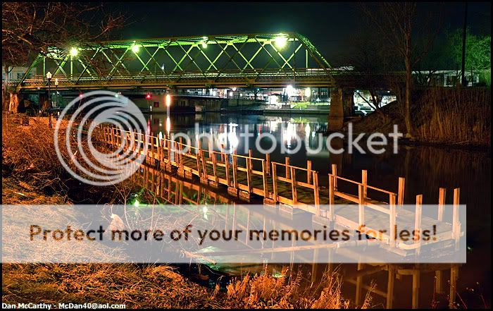
Since this place is only a few minutes from my house, I want to get some serious critiques so I can figure out what I can do to improve shots from this place and I could go back tomorrow or whenever really :)

So please help me improve on these if you could :)

greenbridgenight.jpg


greenbridgedocknight.jpg


[edit]
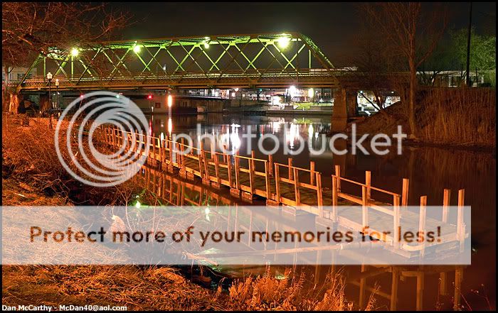
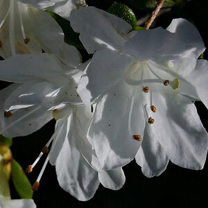
I fixed the color balance of the one above since I thought it was too orangey.
greenbridgedocknight-edit.jpg
 
Compositionwise I wouldn't change a thing.

Colourwise - well at first I thought: hey, why did he take away the colour, but the longer I look at it, the more I think you did right. The second is better, indeed.

My slow computer is still struggling around a third (?) which I might get to see once I've posted this post. Hang on.
 
Ah: now I see! I was actually talking about Photos 2 and 3 first, for No.1 didn't want to show up.

As to the first - it's hard to say. Initially I thought: oh, I don't like that footpath at the bottom. Cropping it would then make the street light grow out of nothing. Not good... Hmph. Well... The branches and twigs are all unnecessary, though. Actually I find those distracting (and I still find the footpath - or such large part of footpath - distracting, too).
 
ooo... i love number 1.. thats a great picture.. very balanced.
 
Love them. I prefer 3 to 2 - I dunno, looks more "realistic" somehow. (no, I can't explain any better than that). Nice work again Nytmare.

*a bit later - I have one crit. (and I really had to work on this) - I would have liked to have seen three different shots (1, 3 & another) to make a series for the one frame.
 
Nice colour. I'm on the fence with the re-balanced one. I really like the saturation in #2, but I can see the benefits of the edit to #3. Going with the gut, I like the pre-edit. Nice :)
 
The only one that has any interest for me is number one. Two and three look like the pictures taken for a survey - sorry... In number one I like that the reflection is visible but the source is covered by the bridge. Seeing that restaurant or whatever it is is distracting. I know you wanted to get the green of the bridge and the orange of the dock but those angles don't work for me. Careful that street lamp gets lost in the black of the water.
 
I like the first one :) I like the greeness (is there a word like this?:p) of the bridge and the contrast it makes on the very black background
 
It's VERY difficult to take good photos of scenes like this, because in each shot there's a number of things that vie for your attention and your eye wanders around looking for that one key point of interest and there isn't just one, there's a number of them, hence the 'confusion'. In the first shot you've got the bridge, the lamp and the footpath. In the second shot(s) you've got a sideview of the footpath (and its hypnotic reflection) and the bridge. My thoughts would be to try to find an angle which allows you to capture just one of these things at a time, but that may not be possible.

Am I making sense, or do others thinking I'm talking out of my ass?

As far as colour-balance is concerned, I prefer the intense warmth of the uncorrected shot.
 
i agree that they seem a bit too busy, especially with all the reflecting lights under the bridge... if I could get a simple image of the dock with it's reflection, i think that may be the best... I'll have to take a trip back there soon (it's pouring rain out now... :()
 

Most reactions

New Topics

Back
Top