"Helen"

photelle

TPF Noob!
Joined
Nov 21, 2007
Messages
40
Reaction score
0
Location
Evanston, IL
Can others edit my Photos
Photos OK to edit
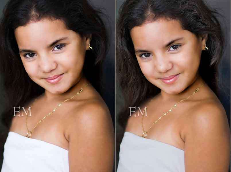
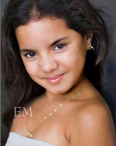
Critique please... Not my daughter so don't hold back!

85mm, f/1.8, 1/400, ISO 200. Natural light - she's standing in doorway to a patio, I am outside on the patio.

hIMG_2689-01.jpg


Thanks!
 
Dude what you can do with a low resolution pic? That said, your logo is frigging annoying, move it to the corners and make it smaller.

On the photo itself, the lighting is good, but you can still see the shadow in the back on the left side.
 
Hmm. Added a higher res version with smaller watermark, hope that's better.

I should add, this is natural light - she's standing in a doorway and I'm outside. I'll add that to the original post too. I agree, there is some darkness on her left side.. This isn't a shadow she's casting though, it's something in the background. The bed I think? Not sure.

Thanks for your response :)
 
Bump... I'd really like some more cc before I print this and send it back to Cuba!
 
I like this portrait. It's incredible for only a single light source. I applaud the way the subject kisses the right-side border. I don't mind the hair's low exposure on her right side. On my monitor, there's enough exposure to recognize some detail in that area of the hair and it maybe enhances the expression and skin tone. I like how the eyes are on a diagonal axis.

Lighting ratios used in children portraiture are usually more high-key, but I think this low-key lighting works very well here.

My only nit-pick would be that the top of her head is cut off. I would have liked the shot even more if there had been a kiss at the top border.
 
Thats a nice photo.
However, I have no problem with any of it except the skin tones.
Where the light is strongest, across her forehead, down her nose, across to both cheeks, down the sides of her cheeks (mostly her right cheek) and on her chin, I know it sounds like a lot but its no big deal.
Anyway those areas have a pinky fringe/tinge, it doesn't seem to match her general skin tone.
It might be my moniter, its never been calibrated.
Your average mother or father will be so starstruck with this image of their daughter, they probably wont notice or even care.
I love you left her blemishes in, nobodys has perfect skin, it adds realism/charm.
Maybe the compression of pasting has taken its toll a little...
 
I like the picture overall, the pose, the smile, etc.
I do think there are some defects that can be fixed with some pp.

The hair is so dark as to merge into the background and lose detail.
The face is so contrasty and bright that the complexion looks blotchy
The dress is so bright that it loses detail.

These fixes would be much better on a high res original but I made a try.

I hope that watermark will get smaller and go somewhere else before you print it.

girlportraitdb7.jpg
 
BTW, why crop this as you did?
A 4x5 is tighter, you lose most of that glaring white dress, cheaper to frame.
croppedhelenbu7.jpg
 
Thank you for your responses!

Midnitejam - Thank you for the compliments. The original photo did not cut off her head, but I found this crop to be the most effective since I didn't have any more space to the bottom. Here's that crop, do you prefer it?

Joxby - Thank you, I do see the pink now that you mention it. I'll work on the full-res file and see if I can get it out.

The_traveler - Thanks for your plays! I like what you did with her skin, what was your process? I like the detail in her hair too, although I think too much detail there makes it look a little dry/frizzy. I will work on that. Thanks also for your crop. I'm not sure what size I'll be printing this yet, but yes, any space taken off will come from the bottom. I'll go back to the original and darken the dress a little too, if possible. Thanks again for taking the time, I appreciate it! I hope you'll see this and tell me what you did with her skin :)

Thanks again for the comments, all!
 
I think it's good to add the watermark on an annoying spot in the image. You never know who might "steel" your image, and low-res files are perfect for web-usage.
That said, I love the pose, light and everything about the photo. That's a real good job you did there!!!
 
Thank you for your responses!
The_traveler - Thanks for your plays! I like what you did with her skin, what was your process? I like the detail in her hair too, although I think too much detail there makes it look a little dry/frizzy. I will work on that. :)

If you use Shadow/highlights tool in PS, you can change the hair and reduce the mid-range contrast that will change the face complexion also.

Conditioner will help the dry/frizzy hair.:blushing::blushing:
 
Duh I forgot to attach the other crop.. Here it is!

post-13634-1195864321.jpg


I forgot to mention the watermarking in the other post.. Of course that'll be removed for print, but I'm not comfortable posting this online with no wm. And small and in the corner really doesn't help since it can easily be cropped/cloned out!

Thanks Phakimata for your comments!

And the_traveler - I will try shadow/highlight, thank you. Point taken on the conditioner :p but her hair isn't gray, so I don't want to make it look it! Thanks again.
 
Thank you for your responses!

Midnitejam - Thank you for the compliments. The original photo did not cut off her head, but I found this crop to be the most effective since I didn't have any more space to the bottom. Here's that crop, do you prefer it?


photelle, thanks for the comparison. I much prefer your original crop. My suggested crop is a dismal failure. You do good work.
 

Most reactions

Back
Top