Hello. New. Pics.

cbryan

TPF Noob!
Joined
Nov 17, 2008
Messages
31
Reaction score
0
Location
tyler
Can others edit my Photos
Photos NOT OK to edit
Hello gang!

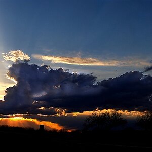
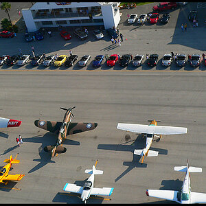
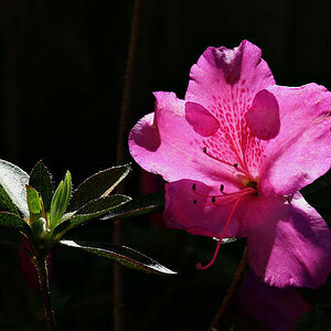
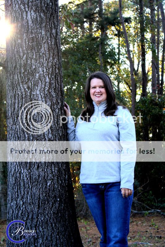
I've been browsing the forum for the last week or so and am thrilled to find this place. It is an excellent resource! I recently purchased a Rebel XS and have enjoyed getting back to photography. A decade ago I spent a fair amount of time shooting black and white on a Canon AE-1 before moving on to a sony W-5 P&S. It's nice to have a little more control of my photographs and the DSLR has really helped me realize how much fun photography can be. Anyhoo, here are a couple of pics. Feel free to comment.

1. sunset (playing with under exposing)
11-15-08180.jpg


2. the wife was nice enough to stand still (pumped up the contrast in CS3)
amantree.jpg
 
Personally I feel that the first pic is too dark, but the second is good. The focus is spot on in the second pic, the only way i would change it would be to have a different angle/approach to the shot...
 
Welcome to ThePhotoForum!

As to some C&C ... the first sure shows an interestingly lit sky (cloud cover lit up from below), but I feel there is just too much silhouetted greenery (now black) intruding from all sides, making large parts of the photo only black and almost dividing it into a black left and a sunset-right part.

With regards to the photo of your very, very pretty wife ... that bit of sun included does all it can to take away from your intended subject. It's just what bright lights do to us: they pull the gaze towards them. So if upon composing in camera the sun peeked in there, you might still like to crop it in post processing.

Compositionally, I feel that one's lacking, too, since there is so much room above her head, which serves for nothing, really, yet you cropped her legs shortly underneath her knees. OK, you did not crop right through them, which would have been the absolute no-no, but ... with all that room above her, I wonder: why not include the whole her into your frame? But not all is lost: a nice crop in pp can still make this a pleasing photo!

As to the pp you applied, I feel it works well for the top part of her body but the effect is too strong on the blue of her blue jeans. Just a feeling I get ...

All in all: nicely done, and once again: welcome to ThePhotoForum.
 
First photo is quite nice but needs to be cropped a little tighter in order to lend more emphasis on the sky. Right now the sky looks like it's being crowded by the silhouettes, by reducing the area of the silhouettes in the picture you add more emphasis to the sky.

And prepare for a fair bit of opinion here *ouch, sorry*
Second photo needs to be zoomed in quite a bit on the face. As mentioned, 1) lens flare is bad here, 2) we don't care *too* much about the forest behind and above your wife and as such needs to be cropped out a bit more, 3) generally you want to avoid (excuse the crass) crotch shots in portraiture unless we're doing full-on shots (this isn't one). I notice your wife is touching the tree - but the way she holds her posture, she seems rather distant - the gesture almost says "there, there little tree". In this situation you might want to have her lean her head and shoulders against the tree, shoulders turned a little back on the left side from the photographer's perspective, and taken from a slightly higher perspective with the chin extended in order to eliminate the double chin - and add a little bit of forest bokeh to the right side of the photo for proper spacing, seeing a progression from a relatively vertical tree trunk to a diagonal face and rolling off into space so to speak.

Hope this helps you :)
 
This is very subjective, but I feel the colours on the second shot are a bit cold. I think it ties in with your wife's attire as well. Same with the comments above, pull in closer and experiment bringing up the warmth a bit more. It may help add intimacy to the shot and help augment that fall feel. :)
 
Thank you all for your insight. I actually liked to sun poking from behind the tree on the wife's shot. Thus the way the shot was framed. I'm looking forward to sharing more in the future and once I get some legs in here, I'll rip you guys too pieces!!! Just kidding. ha! Once again, thank you.

c.
 
Last edited:
In regards to framing the picture around the sun, if it were done more prominently, to where the flare was incorporated into the picture instead of seeming like a consequence of poor composition, it would probably work better.

However the biggest problem is the post work on the file that has added WAY too much blue into the photograph, to the point where even the tree is coming off blue.

Thank you for the remarks. I was trying to be subtle with the sun but after hearing the comments, I would agree that it does draw too much attention.

ANDS, I will also agree with you. In looking at the pic once again, I do think it is a bit too cool. It was taken late in the afternoon and I think once the contrast was boosted it really accented the coolness of the lighting.

Once again, thank you to all who have commented. Every suggestion has been most helpful.

c.
 

Most reactions

New Topics

Back
Top