helmet and sword

rob.trek

TPF Noob!
Joined
May 26, 2014
Messages
32
Reaction score
4
Location
Utah
Can others edit my Photos
Photos OK to edit
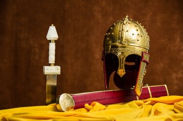
I am new to studio lighting and made this image in my garage/studio. I posted it and received this reply:

Lighting seems off a bit, lot of feedback off the yellow light ban from the cloth back into the helmet. Contrast isn't as crisp as you'd like.

So, what should I do to make this image better?
141124.2355.0012.jpg
 
The first thing that grabs my eye is the large, harsh highlight on the helmet, generally indicative of a light which is either too close, too strong, or too lightly diffused, or a combination of those. How did you light this scene?
 
15 degree grid on the left side of the set aimed at the hilt of the sword.

bowl reflector on the helmet side pointed at the ceiling; no diffusion because I concluded that the ceiling would create sufficient diffusion. From your reply I now wonder if this, in effect, created a large light source further away, which would diminish the diffusion of the light.

metered to have light on both hilt and sword close to equal

Camera white balance set to match white balance of strobe (5600K)(camera set to 5550, which was as close to 5600 as it allowed)
Einstein strobes
D3s; 1/200; f/5.6; ISO: 200

Used a gray card to verity white balance
Lightroom shows 'as shot' white balance to be 5450; the LR adjusted WB shifted the wb to 4600. Because I set the camera WB to match the light output, I concluded that no adjustment was necessary. Now I realize that the WB is off. So, it seems that the camera WB setting is not accurate even even set to a specific Kelvin value.

This is the version with the WB balanced to the gray card value.
 

Attachments

  • 141124.2355.0012.jpg
    141124.2355.0012.jpg
    78.7 KB · Views: 207
15 degree grid on the left side of the set aimed at the hilt of the sword.

bowl reflector on the helmet side pointed at the ceiling; no diffusion because I concluded that the ceiling would create sufficient diffusion. From your reply I now wonder if this, in effect, created a large light source further away, which would diminish the diffusion of the light.

metered to have light on both hilt and sword close to equal

Camera white balance set to match white balance of strobe (5600K)(camera set to 5550, which was as close to 5600 as it allowed)
Einstein strobes
D3s; 1/200; f/5.6; ISO: 200

Used a gray card to verity white balance
Lightroom shows 'as shot' white balance to be 5450; the LR adjusted WB shifted the wb to 4600. Because I set the camera WB to match the light output, I concluded that no adjustment was necessary. Now I realize that the WB is off. So, it seems that the camera WB setting is not accurate even even set to a specific Kelvin value.

This is the version with the WB balanced to the gray card value.
Everything in the scene is some sort of yellow or red. That is going to pollute the light, causing a shift. Not only that but you used the ceiling as a bounce. Any color in the ceiling (most are slightly yellow) will pollute the light as well. Just setting the camera to the lights natural color isn't enough, you have to be able to accommodate for color pollution through reflected color. That is the whole point of grey cards and color checker panels.
 
bowl reflector on the helmet side pointed at the ceiling; no diffusion because I concluded that the ceiling would create sufficient diffusion.

In that setup, could the helmet "see" the flash? Unless you completely blocked the flash directed toward the helmet, then you're not getting what you thought you were getting, namely; a "bounced" light from the ceiling, but rather a mix of bounced AND direct.

Anyway, back to the other things. Is the yellow cloth integral to the shot? If not, remove it.

I am wondering why not show the entire sword?
 
I am glad I used a gray card.

So, what can be done to eliminate the glare on the helmet that you mentioned in your first reply? I tried a large softbox close to the helmet and the result was a reflection of the white softbox on the helmet, which is the reason I pointed the light at the ceiling.
 
bowl reflector on the helmet side pointed at the ceiling; no diffusion because I concluded that the ceiling would create sufficient diffusion.

In that setup, could the helmet "see" the flash? Unless you completely blocked the flash directed toward the helmet, then you're not getting what you thought you were getting, namely; a "bounced" light from the ceiling, but rather a mix of bounced AND direct.

I did not see a reflection of the strobe on the helmet with the strobe directed toward the ceiling. With a softbox directed toward the helmet the reflection of the softbox was visible.

Anyway, back to the other things. Is the yellow cloth integral to the shot? If not, remove it.

It is not integral to the image. I added it because there is a large blank area in front of the scabbard that was illuminated and yet had nothing to see.

I am wondering why not show the entire sword?
I wanted something vertical to balance the height of the helmet. If the sword is shown in it's full length the shot will be wide with a lot of empty space. As I consider your suggestion I want to try this with some different angles of view to see if there is a way to show the entire sword and still maintain interest.
 
I am glad I used a gray card.

So, what can be done to eliminate the glare on the helmet that you mentioned in your first reply? I tried a large softbox close to the helmet and the result was a reflection of the white softbox on the helmet, which is the reason I pointed the light at the ceiling.
Place the light behind the helmet (not directly behind of course) and use a bounce card to fill the front. That's the thing with still lifes, they're usually lit from either directly sideways or slightly behind; vs. portraits that are lit from the front. You'll still get some sort of rim or highlight of course, but it won't be an offensive spot right on the front of the helmet.

Thank you! I will experiment with this today.
 
[/QUOTE]Everything in the scene is some sort of yellow or red. That is going to pollute the light, causing a shift. Not only that but you used the ceiling as a bounce. Any color in the ceiling (most are slightly yellow) will pollute the light as well. Just setting the camera to the lights natural color isn't enough, you have to be able to accommodate for color pollution through reflected color. That is the whole point of grey cards and color checker panels.[/QUOTE]

I tried this with a fluorescent light on the background that claimed to be color corrected. The light from it rendered the background close to the actual color, but not exact. For this shot, I did not use the background light (set the shutter speed to 200 eliminated this light, right?). the flash wiht the grid provided enough background light.

If I use a gray card in a mixed lighting situation, bounce, florescent, and 'color pollution', will the post process correction to the gray card WB correct the mixed WB issues, or is there a different and better method?
 
If I use a gray card in a mixed lighting situation, bounce, florescent, and 'color pollution', will the post process correction to the gray card WB correct the mixed WB issues, or is there a different and better method?

I think the problem then becomes: "What color of light is on which side of my composition?"

How do you correct for one type of light on say, the left side, when the right side is lit by a different type of light altogether?

And what type of light is on your grey card?

Very astute points. So, it's best to eliminate as many variables as possible and use one type of light of the whole scene. So, in this case, the better solution is to use a third Einstein on the background (or a similar strobe with the same light color as output). And also use a White Balance card.

As far as what type of light is on the gray card, my only idea is to take shots with a gray card in various positions in the set and then later figure out what looks the best. For this set, I set a gray card near the white hilt since I know I'll want that the be the correct color.
 
rob.trek said:
So, it seems that the camera WB setting is not accurate even even set to a specific Kelvin value.

Well, no that's inaccurate; what's "not accurate" is Adobe's best guess as the the actual white balance on .NEF files created by all recent Nikon bodies. Nikon has encrypted its raw file white balance since 2005. Adobe products literally take their best guess at the WB. It's not uncommon for Adobe software to look best with a WB that's as much a 1,000 degrees Kelvin "off". If you used Nikon Capture to demosaic the raw data, you'd find the white balance would be "right" for whatever you had set it to in-camera. But again, independent software applications can NOT access the encrypted Nikon WB data in the NEF files made since about late 2004. Usually, Adobe products do a decent enough job, but there are times when they are several hundred degrees off, or more.
 

Most reactions

New Topics

Back
Top