#1 shows some promise but it needs a tighter crop. The pavement and railing to the left of the artist form leading lines that conspire to lead the eye out of the frame before its had a chance to explore all of the image. I would crop out the bicycle wheel on the RH edge, crop out the LH side to just behind the artist's chair and take a a bit off the top so that you can't see the tops of the railings and thereby reduce the number of lines leading the eye out of the picture.
#2 might have worked if we could have seen the artist's face but without that human interest it holds no interest for me and I see it as simply a record photo of a painting.
Thanks for all the inputs. The other factor I held out is these are not my images. They are my 11 year old daughter's images. I prefer #1 because it was all her. She saw the scene and grabbed it herself. The second image, I pointed out the scene, told her to take a few from different angles (from behind the artist, etc). It was not possible to grab his face without losing the artwork, because he had roped off his work area. so she would have had to gotten even lower and almost had to shot upwards to get his face.
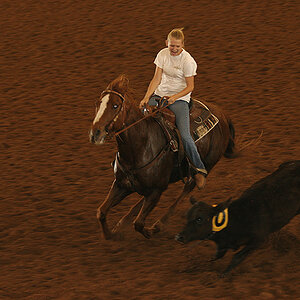
She is in a photo contest with the BETA Club. She took second in state last year in her age group with this image
Thanks for all the inputs. The other factor I held out is these are not my images. They are my 11 year old daughter's images. I prefer #1 because it was all her. She saw the scene and grabbed it herself. The second image, I pointed out the scene, told her to take a few from different angles (from behind the artist, etc). It was not possible to grab his face without losing the artwork, because he had roped off his work area. so she would have had to gotten even lower and almost had to shot upwards to get his face.
She is in a photo contest with the BETA Club. She took second in state last year in her age group with this image
No face in #2 hurts the image, really need to see the artist's face (concentration level) to add interest, at least for me.
I could not keep the aspect ratio right because I wanted the canon in there. Anyway, I am no expert. You just missed the angle. The crop doesn't excite me either.
The second one, by far. I love the way the pants mirror the artwork. But have you thought of cropping from the spray can out to the right? I think it is a discordant note to the color palette of the photo.
And I think it is a really good photo, not just better than the first.
For some stupid reason, the images have to be 8x10 instead of 8x12 (like most cameras take), so here are the final products. I guess that is what happens when non-photographers set the rules

 artist1
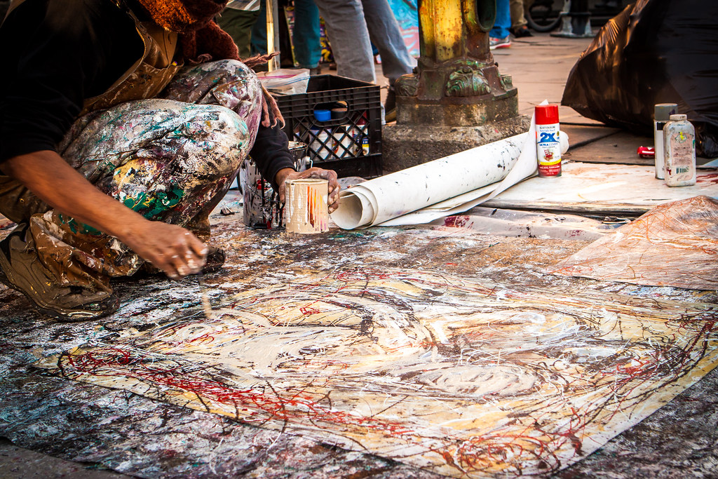 artist2
")
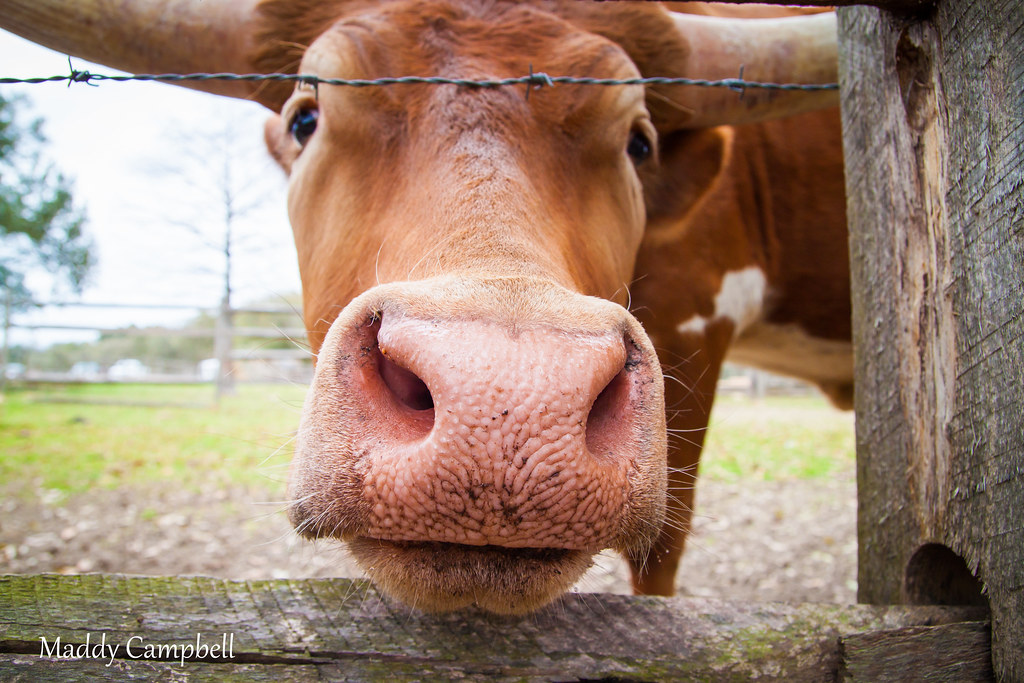 maddys bull
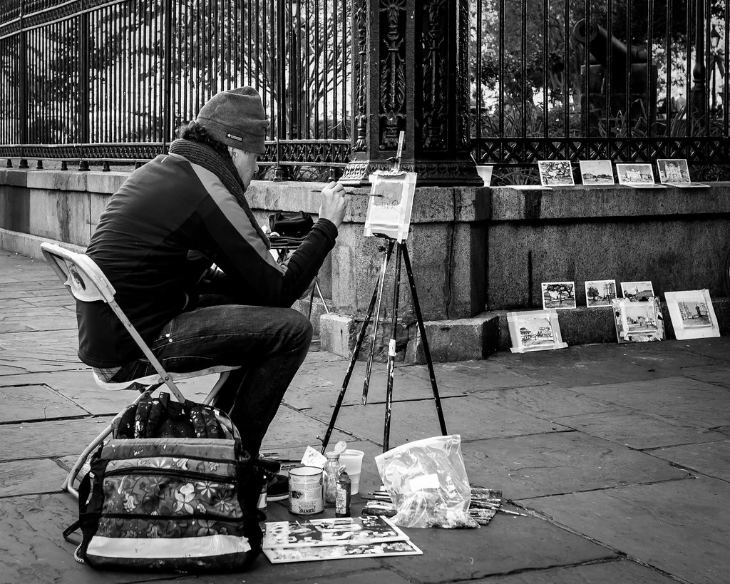 beta2
beta2 beta1
beta1
![[No title]](/data/xfmg/thumbnail/31/31036-0a0c3867fff22fb2065056d7aeea64ed.jpg?1619734581)

![[No title]](/data/xfmg/thumbnail/42/42064-76de02ee1a248037351c52c414af9bab.jpg?1619739997)