Help me get better

N1kon1k

No longer a newbie, moving up!
Joined
Dec 5, 2015
Messages
151
Reaction score
39
Can others edit my Photos
Photos OK to edit
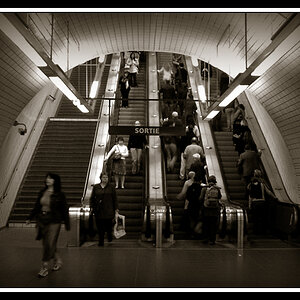
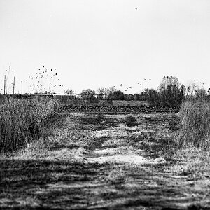
Hey guys still new to the forum I just realized I posted this photo in the wrong section so I hope this is the right place... long story made short only been doing photography on my own for 3 years ... been learning by reading, YouTube etc...
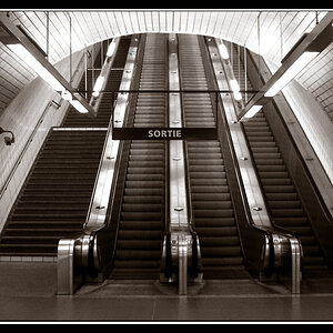
please let me know what you like and what can be done to make the shot better

Shot was taken with a Nikon d5100 with a 18-55mm lens at 10:30pm
Tree.jpg

settings: f8 20sec exposure ISO 100


Sent from my iPhone using ThePhotoForum.com mobile app
 
Eliminate the watermark, and crop some off of the left edge and a bit off of the top, and it will be better. Reduce the vignetting at the corners as well, and it will be better. The tree as "a whole" and as an "object",and as an "'element" of the composition, is too far to the right, and there's too much imbalance in the shot as-shown. Some removal of negative space on the left would help.

The watermark is very large for such a small image, and it's blatantly obvious, and it negatively impacts the shot by being very bright.

Thanks Derrel as for the watermark I had it there because i posted the image on Instagram, I never put watermarks on my shots unless I put them up on Instagram lol. So i agree with you on that aspect...definitely distracts the eye and I should of thought about that before uploading the shot.

As for the Imbalance, do you really think the shot is that imbalanced?
I was trying to use the tree as an element but use the clouds as leading lines to bring attention to the tree itself giving another element to the shot. if you notice the wind is creating the clouds to streak into where the biggest body of the tree ismeaning the branches.

As for the Tree being to far to the right I was following the rule of thirds and positioning it off center so it wouldn't be smack down in the center.

Not trying to disagree with you, just trying to understand where you are coming from and letting you know what i was trying to achieve so I can learn a bit more about composition.
 
N1kon1k said:
As for the Imbalance, do you really think the shot is that imbalanced?
I was trying to use the tree as an element but use the clouds as leading lines to bring attention to the tree itself giving another element to the shot. if you notice the wind is creating the clouds to streak into where the biggest body of the tree ismeaning the branches.

As for the Tree being to far to the right I was following the rule of thirds and positioning it off center so it wouldn't be smack down in the center.

Not trying to disagree with you, just trying to understand where you are coming from and letting you know what i was trying to achieve so I can learn a bit more about composition.

The Rule of Thirds is not really a rule...and yes, the shot is imbalanced. You positioned the tree in the short side of the frame, based on the wind direction in the clouds. This is not a well-balanced composition.

if you want to learn more about actual composition, stop relying on the Rule of Thirds concept, and look into the Elements and Principles of Design. That is what compositions are built around and with....elements, and design principles; composing is more-involved than placing things on grid points. There is more to composing than grid lines.

Maybe try my crop suggestions, and see if you can salvage this and make it a powerful composition.
 
Last edited:
oh no... don't get me wrong i am definitely going to try what you said...Like i stated previously im still learning and i am very limited in what i know so i am just trying to use all the knowledge i have to create something... about design principles I wouldn't even know where to begin because i literally just learned that from you :allteeth:

Feel free to play with the image your way and show me if you have time? i would love to see it!
thank you for taking the time to respond and helping me.
 
Eliminate the watermark, and crop some off of the left edge and a bit off of the top, and it will be better. Reduce the vignetting at the corners as well, and it will be better. The tree as "a whole" and as an "object",and as an "'element" of the composition, is too far to the right, and there's too much imbalance in the shot as-shown. Some removal of negative space on the left would help.

The watermark is very large for such a small image, and it's blatantly obvious, and it negatively impacts the shot by being very bright.

Thanks Derrel as for the watermark I had it there because i posted the image on Instagram, I never put watermarks on my shots unless I put them up on Instagram lol. So i agree with you on that aspect...definitely distracts the eye and I should of thought about that before uploading the shot.

As for the Imbalance, do you really think the shot is that imbalanced?
I was trying to use the tree as an element but use the clouds as leading lines to bring attention to the tree itself giving another element to the shot. if you notice the wind is creating the clouds to streak into where the biggest body of the tree ismeaning the branches.

As for the Tree being to far to the right I was following the rule of thirds and positioning it off center so it wouldn't be smack down in the center.

Not trying to disagree with you, just trying to understand where you are coming from and letting you know what i was trying to achieve so I can learn a bit more about composition.


Three trees ALL to the right of center causes a big imbalance. Crop the left, the clouds to me do not have the effect that you said you wanted, at least not to me anyway. Put the left (largest) trunk just right of the left 1/3 line and you should be close.
.
 
about design principles I wouldn't even know where to begin because i literally just learned that from you.
Much to learn you have. There are books aplenty available. Start with the free ones in your local library in the art section. Then find some online tutorials. Finally, find one excellent book on composition and buy your own copy.
 
Thank you for your input...
Any recommendations?
 
View attachment 133371
Does this make it more balanced? If so can you please explain?


Sent from my iPhone using ThePhotoForum.com mobile app


That does the trick. Very nice
look at the way the large tree appears to both 'protect and point towards the smaller trees. equal interest throughout the picture. Notice that now both the large tree and the clouds lead the eye on an upward diagonal which adds a dynamic quality to the picture. Negative space can be used to good effect, but it is very sensitive to imbalance.
 
Last edited:
A second comment, RE watermarks: in a spartan image like this, laying a watermark right over a significant object, like the bench, almost always hurts the image, and sometimes, it hurts it a lot. A lower left corner watermark would have made the bench a clearly-visible object, and could have allowed the viewer to form a mental storyline about why the bench is there. Instead, with the mark overlayed on something in critical area, the mark really hurts the shot to a huge degree. And the image posted on-line is solow-rez there's little need to worry about it being stolen.

Here is about how I'd suggest cropping this. The above crop makes a VERY different photo than your original image.
Treesnow Jan 12_2017.JPG


The crop above, in Post #8 creates a VERY different image. In the original, and in my crop, the stone ridgeline plays a big, big part. In the crop you did above, the elem,ent of the ridege is eliminated mostly, and it becomes a very "tight frame", as opposed to the original intent, a "loose frame".
 
Thanks guys for the time and effort on this photo I can now see both ideas...and looking back at mine? I can now see the huge impact that both crops create. Funny how to different crops create 2 different views and thoughts.
This is great information for me to consider going forward.

I myself am always worried about negative space, and here I thought there was none...I thought the clouds filled the negative (blank sky) and now i can definitely see that even though the photo is filled (its filled with a huge chunk of boring space left of the tree, distracting the eye)

Please keep an eye on my posts if you come across them going forward and feel free to point things out...
Thanks for all the info once again :Hail.sml:
 

Most reactions

New Topics

Back
Top