Help With Tonal Adjustments

rp1600

TPF Noob!
Joined
Jul 20, 2006
Messages
267
Reaction score
0
Location
Lafayette, Louisiana
Can others edit my Photos
Photos OK to edit
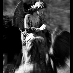
A newbie to TPF and just shot some of my first bridals. While overall I'm satisified with the composition of most shot, i'm having trouble making tonal adjustments in PS. Maybe it's just my straightforward conversion to "grayscale", but most of the images lack contrast and pop, such as the one I've posted here. Any ideas, help, criticism, etc. etc. is greatly appreciated. Please feel free to take a shot at "fixing" this photo.
 
I don't see a photo.

You can try using the channel mixer to simulate BW with colored filters. Other than that I'd read up on using levels and curves.
 
THer'es about a gazillian different ways to do a b/w conversion in photoshop, pretty much every one of them better than a straight grayscale conversion. :D My current favorite is actually to do a b/w gradient map. Gives a really heavy, contrasty b/w.
 
Sharkbait said:
THer'es about a gazillian different ways to do a b/w conversion in photoshop, pretty much every one of them better than a straight grayscale conversion. :D My current favorite is actually to do a b/w gradient map. Gives a really heavy, contrasty b/w.

When you say straight grayscale conversion, do you mean just converting it and then not adjusting the levels or anything?
Right now I just have an old version of PS Elements. I gotta upgrade to real photoshop soon though so I can start shooting in raw!
I'm interested in hearing more about how to use the gradient map for B&W conversion. I don't think Elements has it though...
 
Im interested in hearing more about how to do the b&w gradient map conversion too!!! Like the sound of heave/contrasty tones!! xx
 
Sometimes a straight grayscale conversion can be just what you are looking for. I usually compare several methods of BW conversion for each photo, before I decide on which method I'm going to use. Sometimes the simple way works great, sometimes it gets a lot more complicated.
 
Can you post the original color version?
 
Regardless of the conversion, that image is a little dim and low contrast. The histogram shows that you have white and black points on the image, so you don't have to make changes there (which is a common problem). A simple curves adjustment really makes this pop.
 
Actually, after looking at it again, what I would do is two separate adjustments. One for the dress and flowers and another for the rest of the image. Trying to get her skin looking good can wash out the white dress and flowers.
 

Most reactions

Back
Top