Here is a new Model shot (Might be NSFW)

SpeedTrap

TPF Noob!
Joined
Oct 2, 2006
Messages
1,392
Reaction score
26
Location
Edmonton
Website
www.lightart.ca
Can others edit my Photos
Photos NOT OK to edit
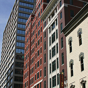
Here is another one I am working on right now.
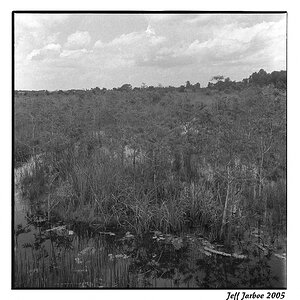
As always C&C is welcome.

_LAP4844.jpg
 
Not sure why, but her face looks fake, as if it were drawn by a sketch artist. Too much makeup maybe?

I like the lighting and skin tones on her body though, good lighting IMO.
 
I agree it feels like there is too much post work done to the skin tones. I also am not a fan of the double shadow from the nose. The lighting has also generated a pair of highlights on the nose that again I don't like too much. I like the pose and that hair fits just right but I would have placed the fill closer to the camera and dropped the power a bit on it (fill) as well so there is deeper shadows the model has great bones and it is such a shame to waste them.
I hope that helps.
Alex
 
there are two problems with this shot.

1) her hair is wider than her body.

2) she needs to move her arm. :p
 
I like the light in this one. The style has potential because nothing is sexier then topless wearing Levi's.

None the less I think it falls short because of her position and arms. Maybe if you twisted her shoulders to the lens? Post the contact sheet and we can help further.

Love & Bass
 
Her face seems to hard or tight...maybe if her expression was more relaxed.
 
there are two problems with this shot.

1) her hair is wider than her body.

2) she needs to move her arm. :p

Yes indeed. Too much hair for that body.


Just to put it in perspective, this is a shot for a salon, so big hair is what they want. but I did not adjust the volume of hair, she just had alot.

Interesting. That being the case maybe an image that includes a head shot an maybe not so much of the subject's torso would work better. The image as it is now as many points of interest which may be a little distracting in my opinion.
 
Really your lightning setup, look really great. The model have amazing hair.
I don't like the blue vein on the breast.
We don't see the other arm, it's disturbing for our lecture of the photography.
 
Her face seems to hard or tight...maybe if her expression was more relaxed.


"hard" was the first impression I had also. Nose shadow is not good. Lighting very harsh. I don't see the blue vein on breast but the underside of her left breast is red like she has a rash.
Tone down, soften, take meanness out of her eyes.
 

Most reactions

Back
Top