OK first off these are three absolutly wonderful shots - technically very good and also creativly intersting and well thought out.
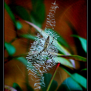
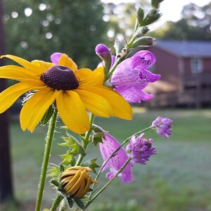
For me though something really standso out about number 1 - not sure what but it really stands out - possibly because it makes good use of a busy background which is not distracting but part of and adding to the shot
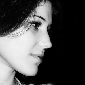
#1 has mood, something that 2 is lacking. #1 also pops since everything but the one flower is out of focus. In the other two, there is some form of competition for attention.
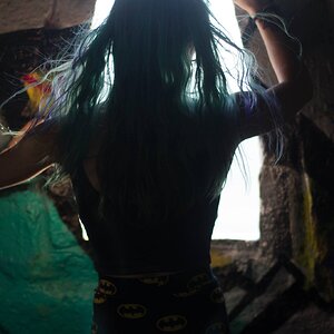
The focus on #3 bothers me. I don't like that some of the hair things' tips are out of focus.
1. Love the exposure, and main subject, but the bright white areas in the lower left are to me, somewhat distracting.
2. Agree with others that the bud in the background is a little too much in focus and therefore somewhat distracting.
3. I like the contrast in this one.
WOW, awesome feedback guys, thanks! This is great for learning! A little technical info:
All three are 200 mm macro shots taken with a cheapy wannabe SLR the Knoica Minolta A2 (non-detachable lens). A Kenko MC UV SL-39 filter was used but I doubt it had much affect - it's mostly to keep birdy bombs off the actual lens while shooting the sky above. All were cropped and scaled:
1) About 15% cut off the left side and scaled to 30%
2) About 50% cut off the left and bottom area and scaled 50%
3) About 10% off the right side and scaled to 25%
Processing was limited to full-frame sharpening USM 10% at 50 Pixels, an additional USM at 60% with 1.75 pixels, and whatever looked good for the CameraRAW settings during import into PS.
By kind of an interesting accident (I was thinking about adding a border) B/WStyler applied this preset when I first ran it:
The colors might do some of the subject isolation you all mentioned.
Hehe, I saved off a copy real quick when it did that cuz I thought it looked kinda cool.
It needs tweaking to actually be usable like this tho - I think.
Thanks again for all the feedz and for those voting only it's also very useful and I appreciate it allot! So I thank you too!
I like those colour changes definatly an improvment over the original - I think alse because the shot is not shouting colour at the viewer rather its being muted a little


![[No title]](/data/xfmg/thumbnail/37/37519-6093821531f744039f3ac2b3e30c7dbf.jpg?1619738128)